Playlist Flow
September 2020 • 5 min read
Case
This feature allows to create a new playlist.
Role
UX Researcher
UI Designer
Interaction Designer
Motion Designer
Timeframe
September 2020
Overview
Following a meeting with the business team, a decision was made to work on improving Qobuz app retention by engaging new users as early as possible. When downloading the Qobuz mobile application, the first engaging action a user can take is to save music in their personal library. They can do this either by adding music to their favorites or creating playlists.
User research
The problem has already been identified and validated by the company. My mission was to improve retention by implementing a new playlist creation path on Qobuz applications.
Problem Statement
How might we improve retention of new users through playlist creation so we can enjoy music more efficiently?
Measure sucess
The goal is to increase retention by 10 points within 30 days after the release of the feature. The user activity metrics include quantifiable goals :
- Total no of playlists created per user: Over 1 is GOOD, over 3 is GREAT
- Average size of playlists per user: Over 10 songs is GOOD, over 20 songs is GREAT
- Average playing time per playlist per user per day: Over 20 min is GOOD, over 1 hour is GREAT
UX Competitor Analysis
The analysis was conducted on 4 main brands with iOS. The goal is to know competitor apps to see how they design for their users. Understand how competitors have built the playlist creation journey and assessing the usability.
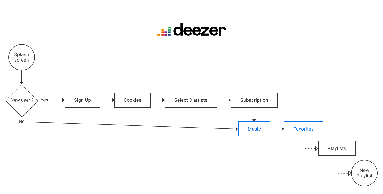
User Flow Competitors
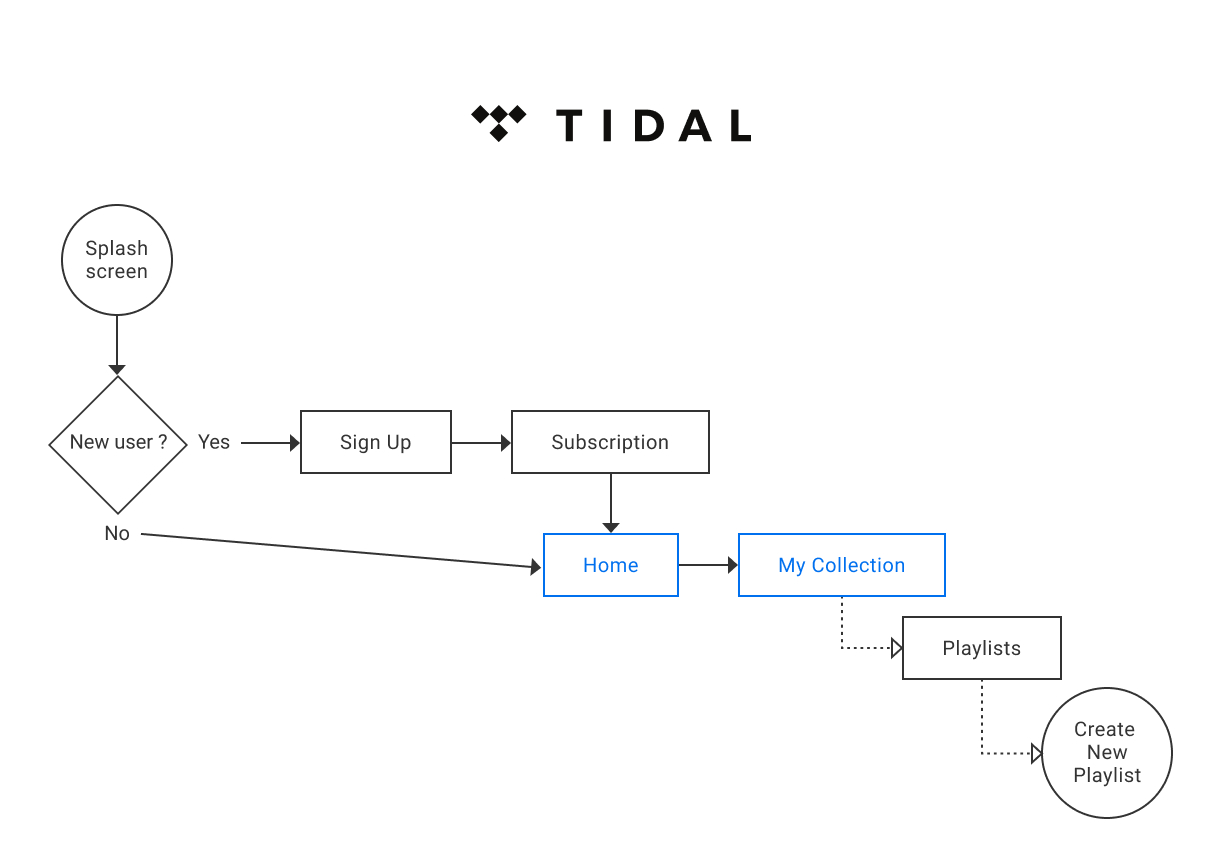
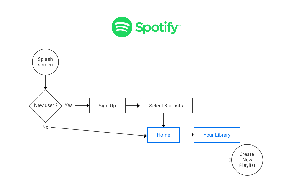
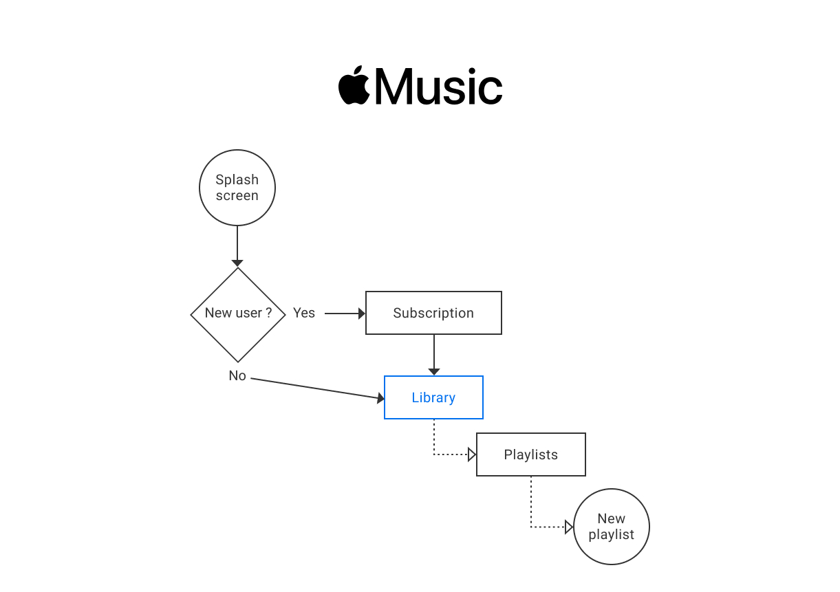
To document my study, I used flowcharts to communicate the user journey in clear, easy-to-understand diagrams. All flows show the user's first connection on the app until the path the user takes to create a new playlist.
Legend: The blue shapes represent the buttons in the main tab bar of the app.

Pros and cons
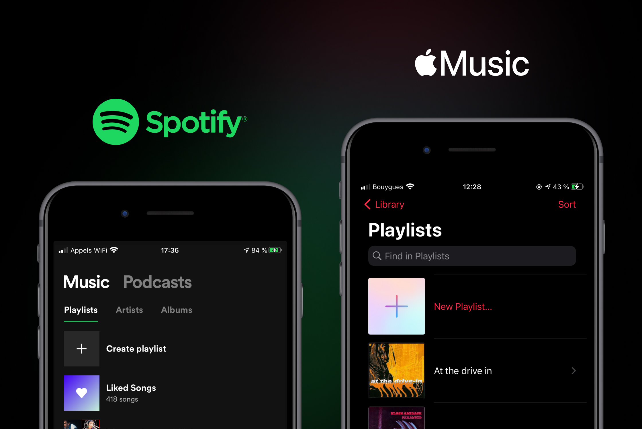
I based my reflection for the ideation on the learnings of the pro and cons of the different competitors. All competitors have a similar information architecture. Tidal and Deezer have a submenu with a long list that doesn't highlight the playlist section and the navigation is a bit boring to find the playlist part quickly. Spotify flow is the easiest way to find and create a playlist. Apple Music offers larger visuals on artist covers that make navigation more enjoyable.
I was inspired by all the competitors and especially by Spotify and Apple Music whose flow is the most consistent and relevant with the Qobuz interface.
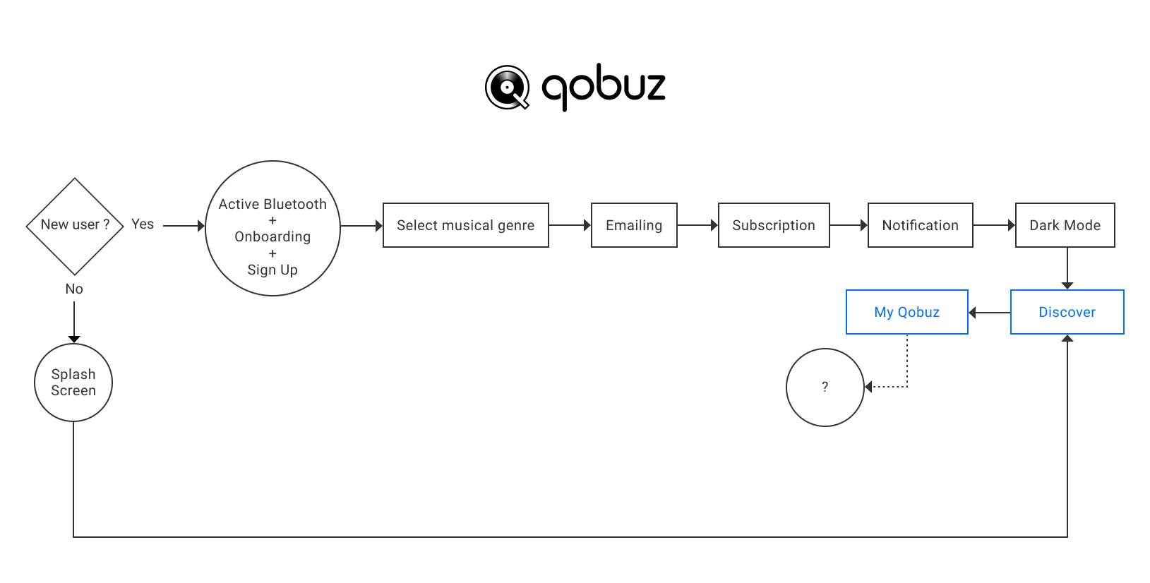
Qobuz User Flow
Pain Point
The user will be able to create a new playlist only when listening to a music/album.
There are things to simplify about the flow of the first Qobuz connection. I don't detail the steps of sign up, subscription... and the sign up is very well done compared to other competitors.
Ideation
The study of competitors and other apps helped generate potential concepts and solutions.
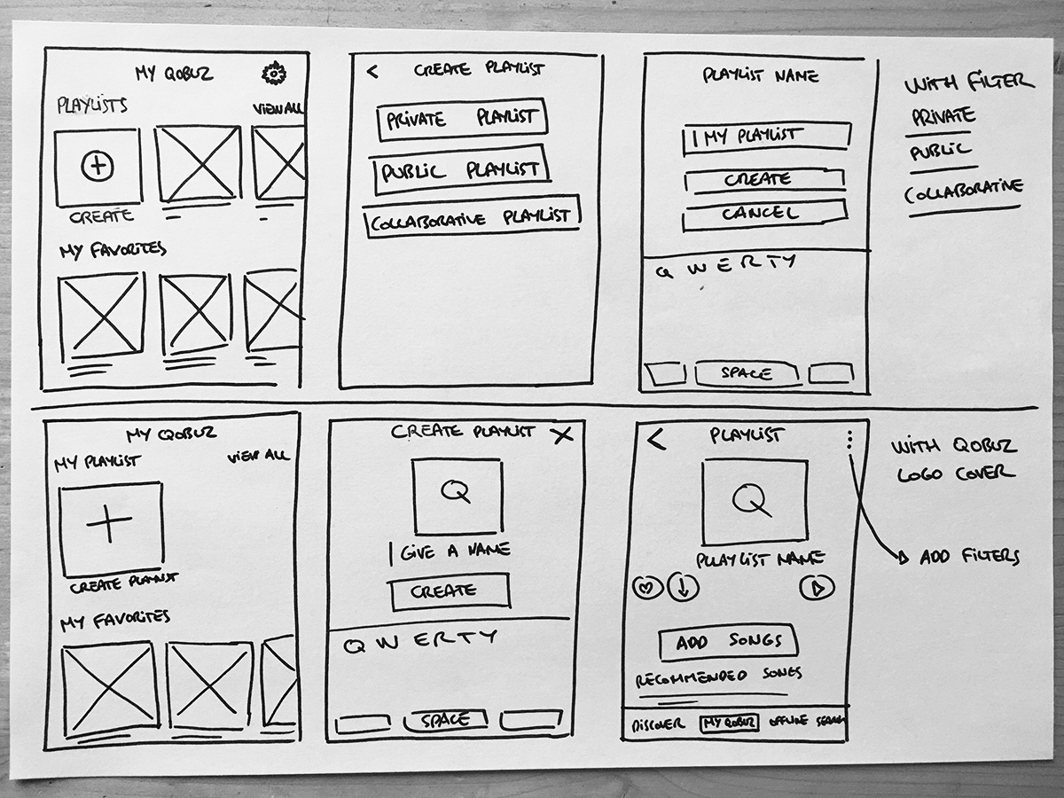
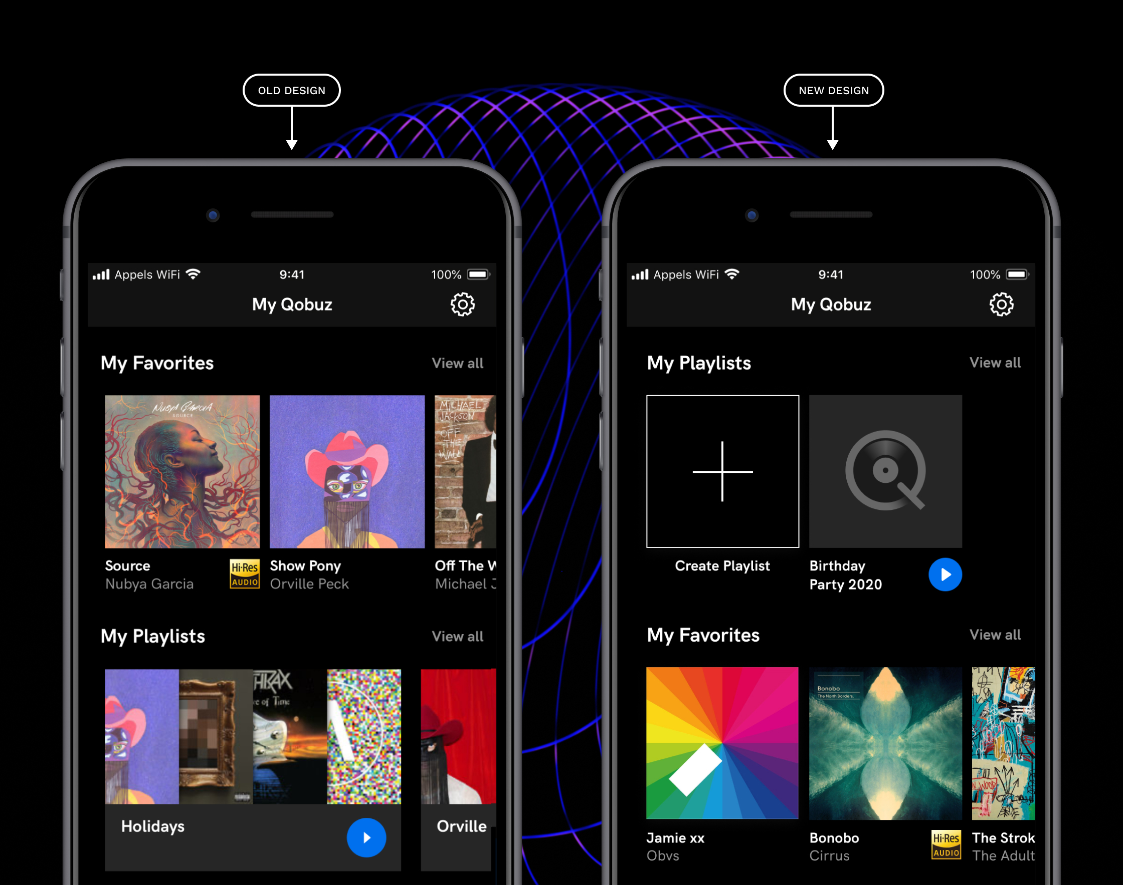
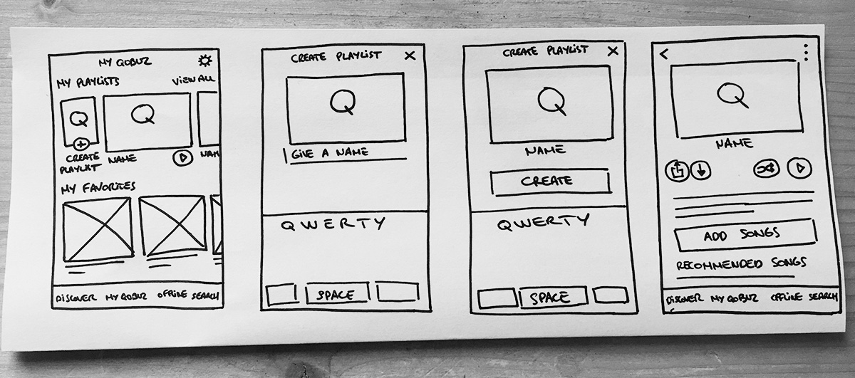
Hi-Fi wireframes
The new design has been improved:
- My Playlist section appears in the foreground.
- Creation of a big button "Create Playlist".
- The new playlist is symbolized by the logo Qobuz with an opacity.
- Square size to maintain graphical consistency.
Iteration
Following a usability test, the design has been refined:
- Horizontal size for the playlists must be respected. I didn't have this information about the style guide. It's mandatory to make the visual difference between playlists, articles and albums (square size).
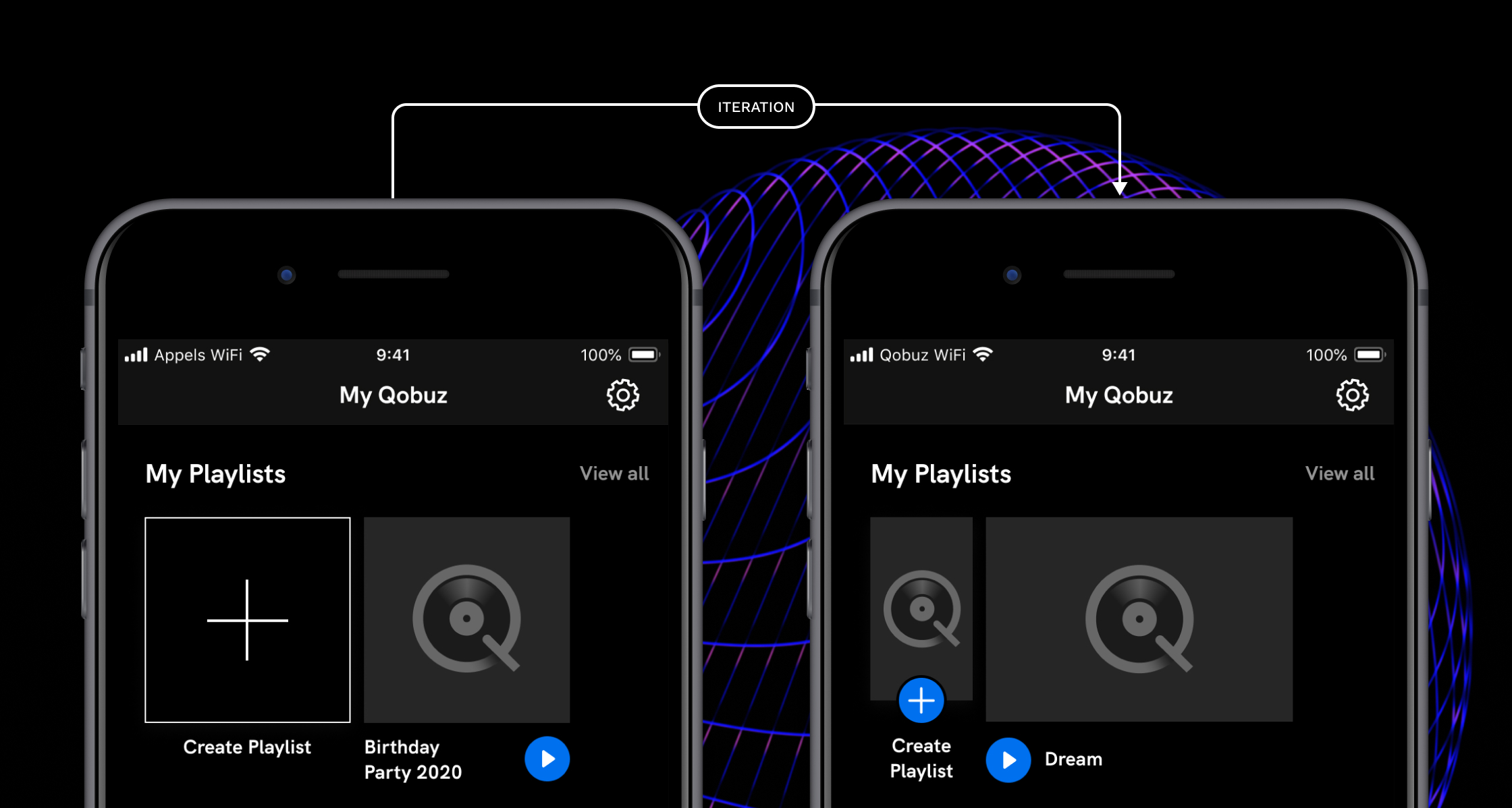
- The "Create Playlist" button is smaller to fit the larger playlists and has a blue button with a plus icon to maintain the consistency with the assets.
- For a better access, the play button goes in front of the playlist name. During the usability test, some users were pressing the wrong play button, so I associated the button with the title.
Playlist layout
The covers were half displayed. Following a usability test, users had difficulty seeing the covers and identifying the artists. The playlist preview is now displayed in full square size. Visually the preview is improved and allow to display more cover (total of 6 vs 3).
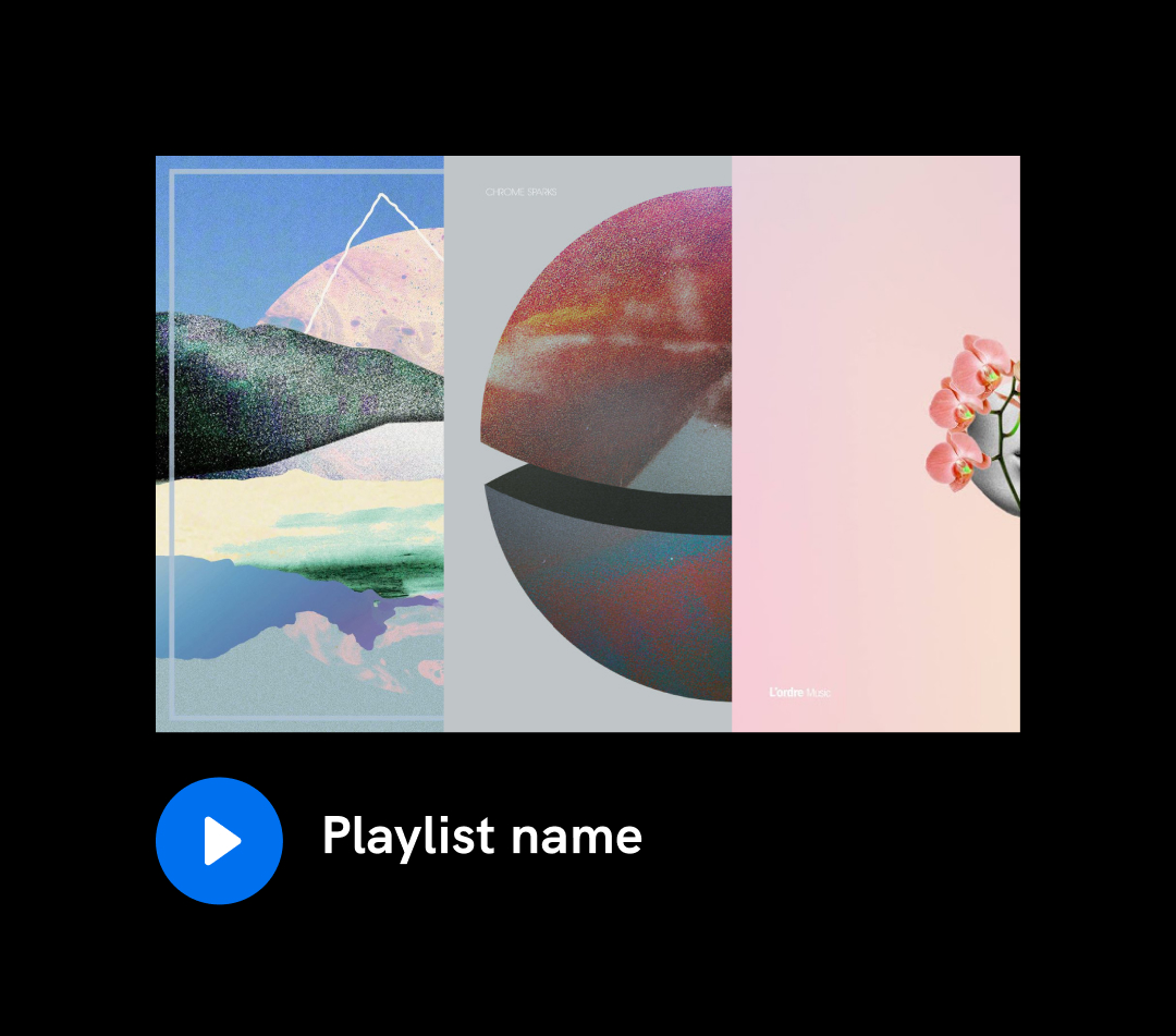
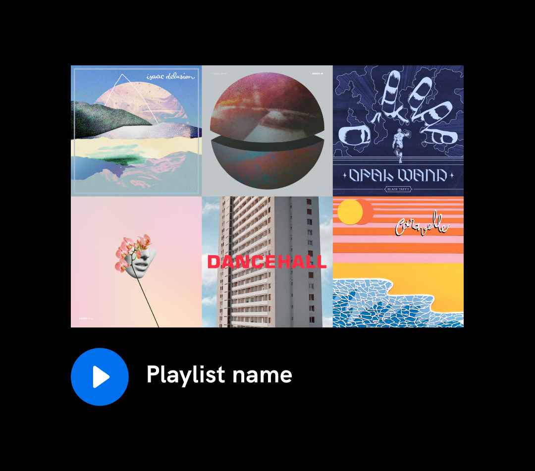
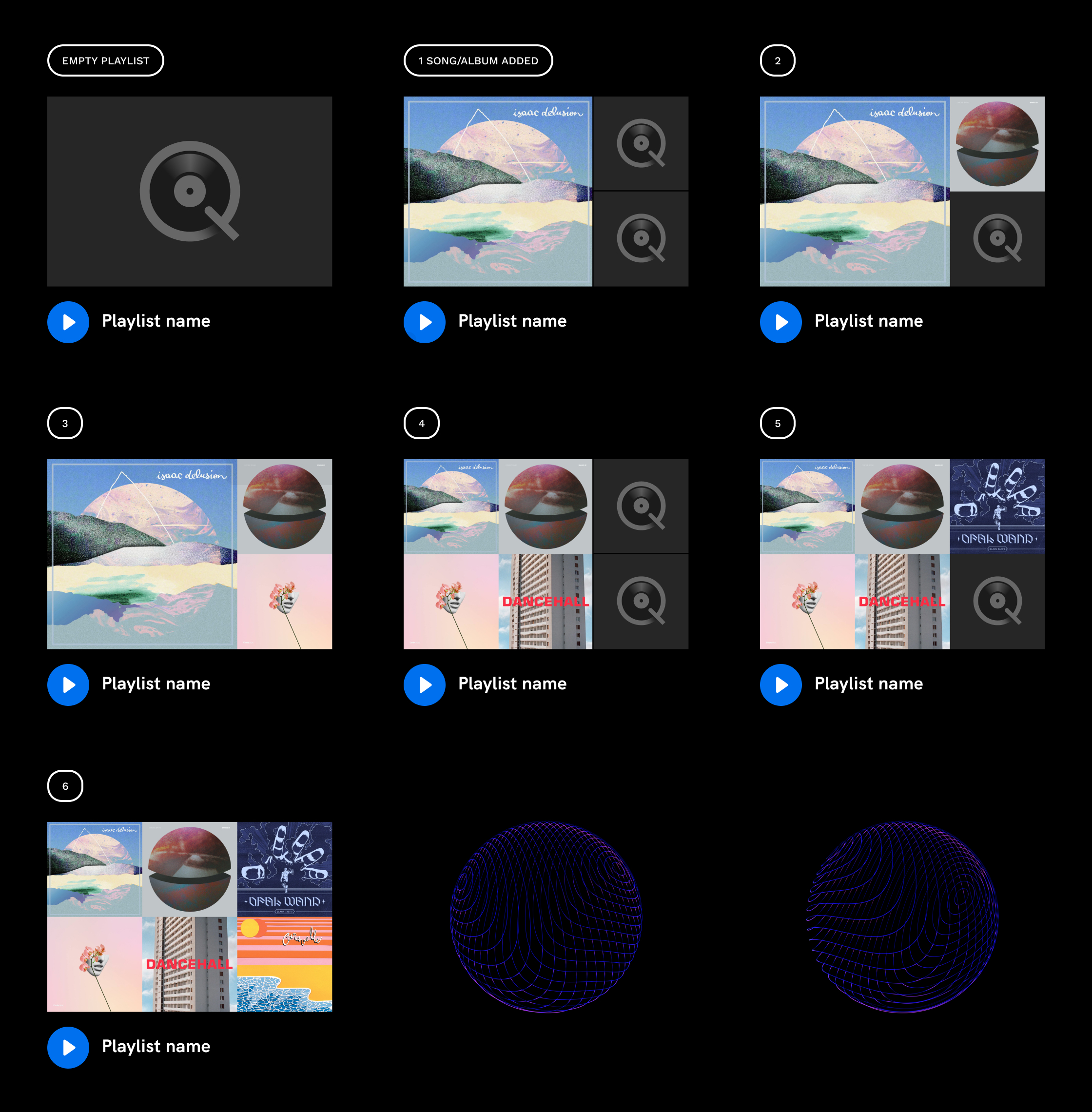
How to display the playlist being created with technical constraint in mind ?
I have been careful to keep in mind the technical constraints of Qobuz. I thought about all the states of the playlist to keep an easy integration for the developers and a consistency display.
Beyond 6 songs/albums added, the playlist is visually frozen. A future user research could determine if the possibility to customize the playlist display is relevant or not.
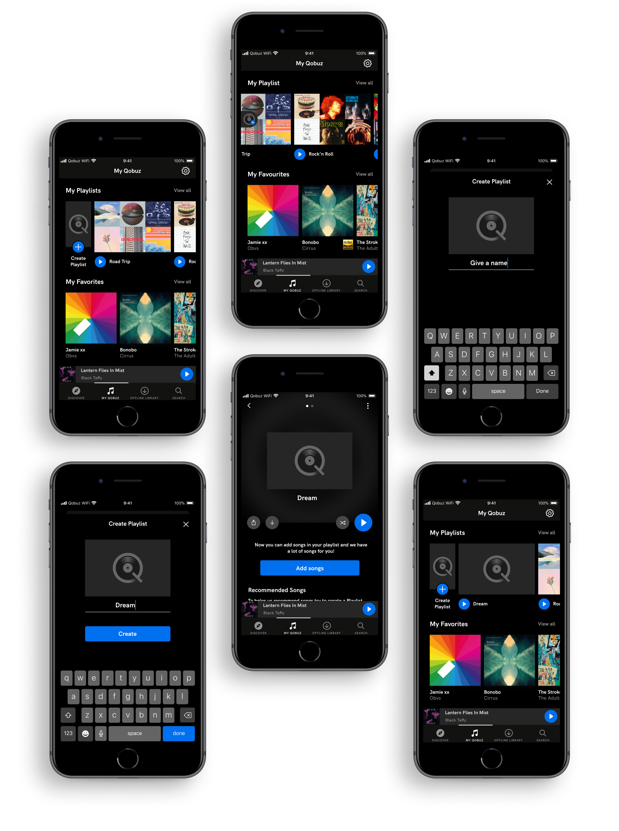
Final Prototype
The goal of the usability test was to evaluate the understanding of the gesture animation. All users adopted this gesture and they created a playlist without difficulty.
Iteration on playlist drag gesture
The animation shows the "create playlist" button scrolling with all the playlists. During the user test, there were 2 scenarios:
- Scroll 3 to 4 playlists before creating a playlist.
- Scroll over 30 playlists before creating a playlist.
The scenario showed that it was boring for the user to go to the starting point "create playlist". To solve this problem, I decided to craft a sticky button.
Add a sticky button
The create playlist button is always displayed. While viewing the playlists with the drag gesture, the size button changes, it is smaller and sticky on the side. The experience is more enjoyable because the user can create a playlist at any time without having to return at the starting point. I was inspired by Facebook app "Create a story" a powerful micro-interaction pattern to improve the user experience.
Enhanced the sticky button with a micro-interaction
Aesthetics of micro-interaction is timely. Drag gesture rotates Qobuz logo disc from left to right. The goal is to bring a better affordance to the action "Create Playlist" and engage the user without distraction.
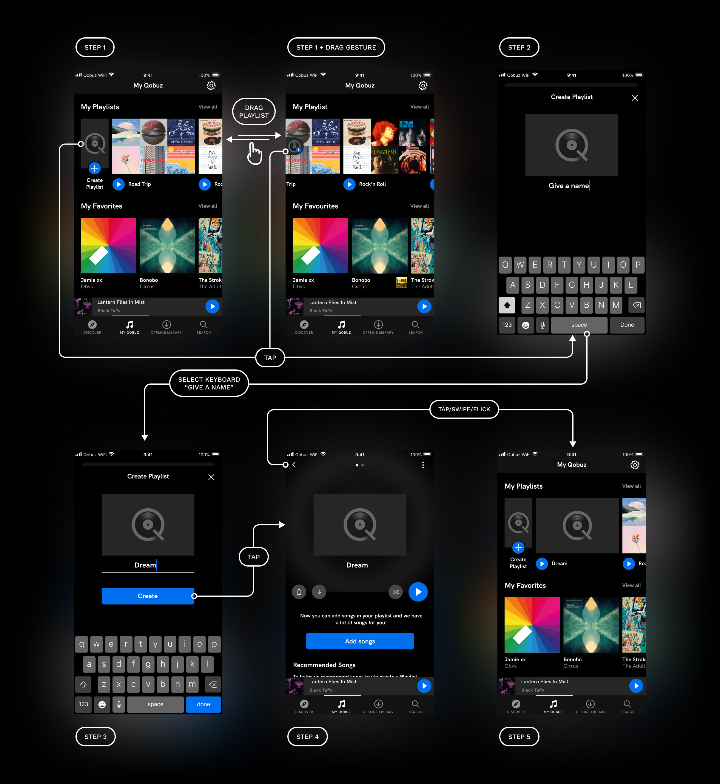
Wireflow
The wireflow shows and explains the different steps to create a playlist. The goal is to better explain to the developer the user's behavior with the interface.
Reflection
Looking back on this project, if I had had the time, I would have done more user testing to gather more insights. Continue to analyze the behaviors and pain points to improve the "create playlist" feature, especially the "View all" part that I did'nt have the opportunity to improve.
It was a pure dope to work for Qobuz! Because Qobuz deeply re-enchants the quality of music in hight quality and impacts the fair remuneration of artists. I've been a Spotify subscriber for 10 years, I'm a music lover. It was a pleasure to solve this case study and meet an important user need. I hope to see the product continue respond to user needs and allow to enjoy music more efficiently.
I hope you like this work!