App
March 2020 • 8 min read (Including tips & tricks)
Case
This app offers to see urban series only in the same place where they were recorded.
Role
UX Researcher
Design Sprint Facilitator
UI Designer
Interaction Designer
Timeframe
Mission 2 weeks
February-Mars 2020
Overview
Igloù create artistic experiences in atypical places. They have a collaboration with the city of Paris and they offer unique experiences in the city: audiovisuals, performances, arts… When a user walks through Paris, Igloù sends you a notification to propose you to walk to a spot close to you where you can play a video and have a unique experience. The user walks to that point and then can play a video. In the video, the user sees a performance filmed in the exact place where he is playing the video. It’s a very special experience because the user is placed at the exact location where the videos were taken.
Challenge
I had only two weeks to build a digital product. Prototype from scratch, UX and UI Design. To create an artistic interface which enables geolocalisation and notifies the user when a video is available to watch in a spot close to him.
Prototype Outcome
Nothing can replace actually experiencing designs on a real device, in a real environment. Prototypes should be tested in real devices as much as possible before considerable amounts of time and resources are spent developing it into the final product.
Kickoff meeting
I met the 2 founders of Igloù. Elena and Rony. My first meeting was only with Rony because Elena was unavailable. This is a very important detail and you will understand why later. The kickoff is the perfect time to discuss goals and expectations.
"Don’t walk into a kickoff meeting
without a game plan."
My plan was to ask some questions about the company:
Culture
- Business goals in 1 sentence
- Brand values
- Baseline
- Brand vision (or CEO’s vision)
- The ideal User Experience with their product
- Company’s culture
Competition
- Ask for direct competitors
- What differentiates them from the competition?
- Ask for 2 apps or website they really like (not in their fields)
Organisation
- Do they have a Tech team?
- If yes, what are their positions?
- Who will be my main contact?
- Who will be my Tech contact for feasibility validations?
- Do they have a design/graphic dpt?
Methodology
- Do you know Design Thinking methods?
- Have you ever worked with Agile methods?
- Do you practice Design Sprints?
- If yes, how long do they usually last?
The product
- What is the problematic we are searching to solve during these 2 weeks?
- How did you come to this problem?
- What priority should my project answer?
Research
- What is your target (precisely)?
- How did they find this information?
- Can I access the Data?
- Can I see the Interview scripts?
- Can I see previous persona?
- Can I access Google Analytics?
- What are their Tech habits?
Restriction
- Do they have a graphical identity?
- Typography
- Colors
- Free legal rights material
- Bought material that they have
- Text content to be provided
First meeting
Rony wants to broadcast videos everywhere in public spaces and on public transport platforms (only bus). The videos will be produced by Igloù but there is no scenario yet. The aim is to make its inhabitants discover the city in a different way, but not the tourists. This concept will be monetized in other cities.
Even though I didn't have a lot of info about the product, I was able to start doing my quantitative and qualitative research to see if the assumptions are good or bad.
First research
I have limited time and resources to perform the research and I decided to do a survey using the Igloù emailing database. Quantitative methods is the best practice to collect objective measurements that are unbiased by the researcher’s hypotheses, presence, and personality. This surveys help me determine the value proposition of this new product from the user’s perspective. This survey help me also preparing the futur user interviews and focus on pain points.
Know the habits of the users.
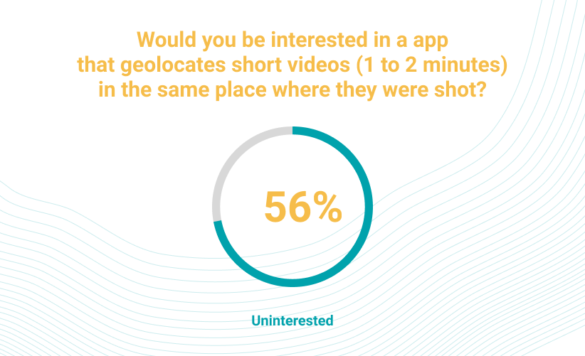
Are user ready to consume videos outside their home when they go for a walk? What are their consumption habits for watching videos?
Here is the link to the original version of the survey (in French).
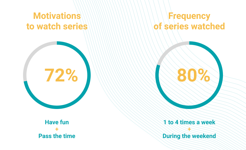
Results on a sample of 100 people:
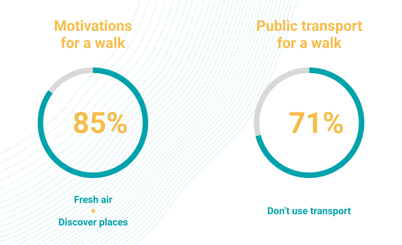
- Only 28% take public transport for walks. While waiting for their transport, they read books, listen to music and watch social networks on mobile.
Second meeting
Four days later, I met the second founder Elena. Elena wants to broadcast videos only on public transport platforms (metro, bus...). The theme of the scenarios will be the theme of "waiting". This is conceptual art. Easy, pleasant to look at and questioning.
"User target just changed"
I'm a bit disappointed, now it's not in urban spaces, only on public transport platforms but this second meeting seemed clearer and more detailed. I am starting to build a new survey targeted on public transport.
Second research
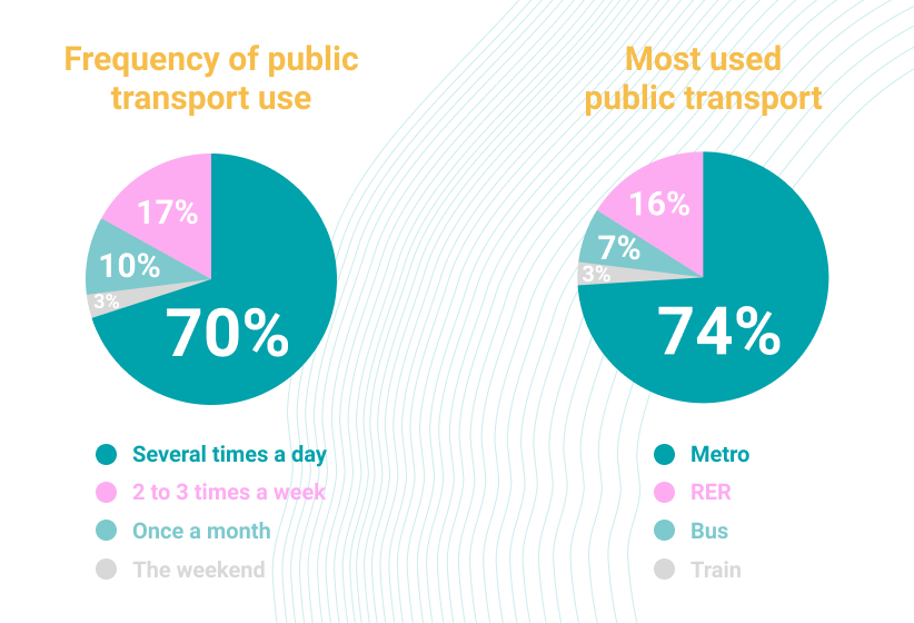
Before preparing a new survey, I asked if the app will exclusively broadcast videos on public transport. The 2 founders said yes. Okay, let's go for a second survey.
Here is the link to the original version of the survey (in French) which has been posted on several social networks.
To work faster and get quickly data, I collected the survey data at the same time as my user interviews. It was easier for me to record the open questions and complete the survey at the same time. I interviewed 15 people at the metro exit.
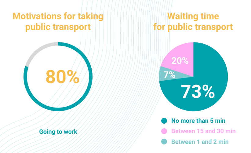
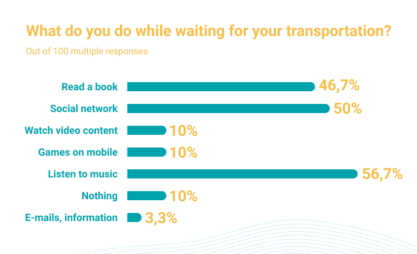
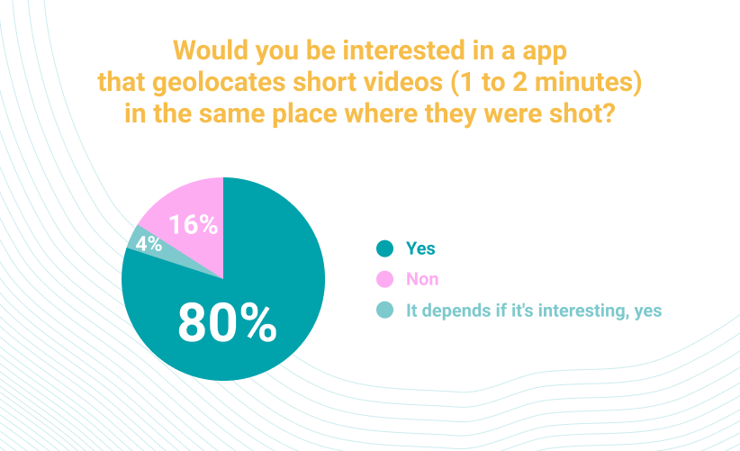
Synthetize the user research
Now, I need to turn data into actionable information. I decided to organize a workshop (one-day) with the 2 founders to do this work together as a team. Igloù is an association, it's like an early-stage startup. They need to structure their ideas and define the problem solving. I would have organized a Design Sprint but block five full days on the calendar was impossible. I was inspired by Jake Knapp's book Design Sprint to create the roadmap for my workshop.
"Turn data into actionable information"
Roadmap Workshop
10H (30/60 min)
List sprint questions
- Who are your users?
- What impact you want to have on your users?
- What is your business model?
- What is the goal of those 2 weeks?
Set a long-term goal
- What is the goal of the app?
- Where do we want to be six months, a year or even five years from now?
Outcome
- Write a summary of all the answers on a whiteboard
Affinity Diagram (30/45 min)
- Review the post-its with the summary of the research
- Do Affinity Diagram
- Create clusters
- Name clusters
- Highlight the main pain points with a dot voting
Define the problem statement (30/45 min)
- Circle the pain point, based on research
- Ask each person to write a problem statement
- Review all the problem statements
- Write final problem statement on post it and put it next to the corresponding pain point
User Journey Map (30/60 min)
- List the actor (on the left)
- Write the ending (on the right)
- Words and arrows in between
- Keep it simple (5 to 15 steps max)
- Ask for help (Does this map look right?)
Redefine the Problem Statement (30/45 min)
- Circle the pain point, based on research
- Ask each person to write a problem statement
- Review all the problem statements
- Write final problem statement on post it and put it next to the corresponding pain point
12H30-13H (lunch)
Lightning demos (30 min)
- Look at great solutions from range companies, including yours.
Four step sketch (1H)
- Notes => Rather notes
- Ideas => Rough ideas and take 3 min to circles the most promising
- Crazy 8
- Dot voting
- Solution sketch (30min) => Self explanatory. Create 3 panel story board. Words matter. Give it a catchy title
- Dot voting
STOP
Review of the work with the whiteboard: Outcome => summary of all the answers.
Workshop
I started the conversation with a series of questions. This question was complicated: What is the goal of the app?
The founders disagreed with the purpose of the app. Especially about where the videos would be shown.
Rony wants to broadcast videos everywhere in public spaces but not on public transport platforms.
Elena the public transport platforms and also in public spaces.
That's why I focused my user research on walks and then on public transport. While I was writing the summary of the whiteboard questions, the discussion between them became tense.
"The discussion between them became tense."
Rony (dryly to Elena): "What's the goal of the app for you, huh?"
Elena (holding the table with her two hands and looking Rony with a killer eyes): "An app that offers videos!"
Rony (to me) "What's the goal of the app?"
Me (At that moment I was a bit distraught because it had been more than 45 minutes the workshop had started and I wanted to move the workshop forward) : "An app that offers...videos as a series...artistic...or not! Obviously there's a lack of clarity between you and that's good because the goal of the workshop is exactly created to help you clarify the objectives and respond precisely to the needs and expectations of your users. We will validate your ideas and assumptions...or not! We will now continue the workshop...
Spontaneously, they thanked me. They had just realized that it wasn't clear between them. The mood is now relaxed between them.
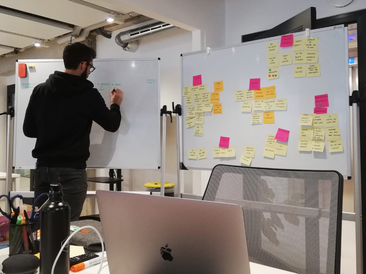
Affinity Diagram
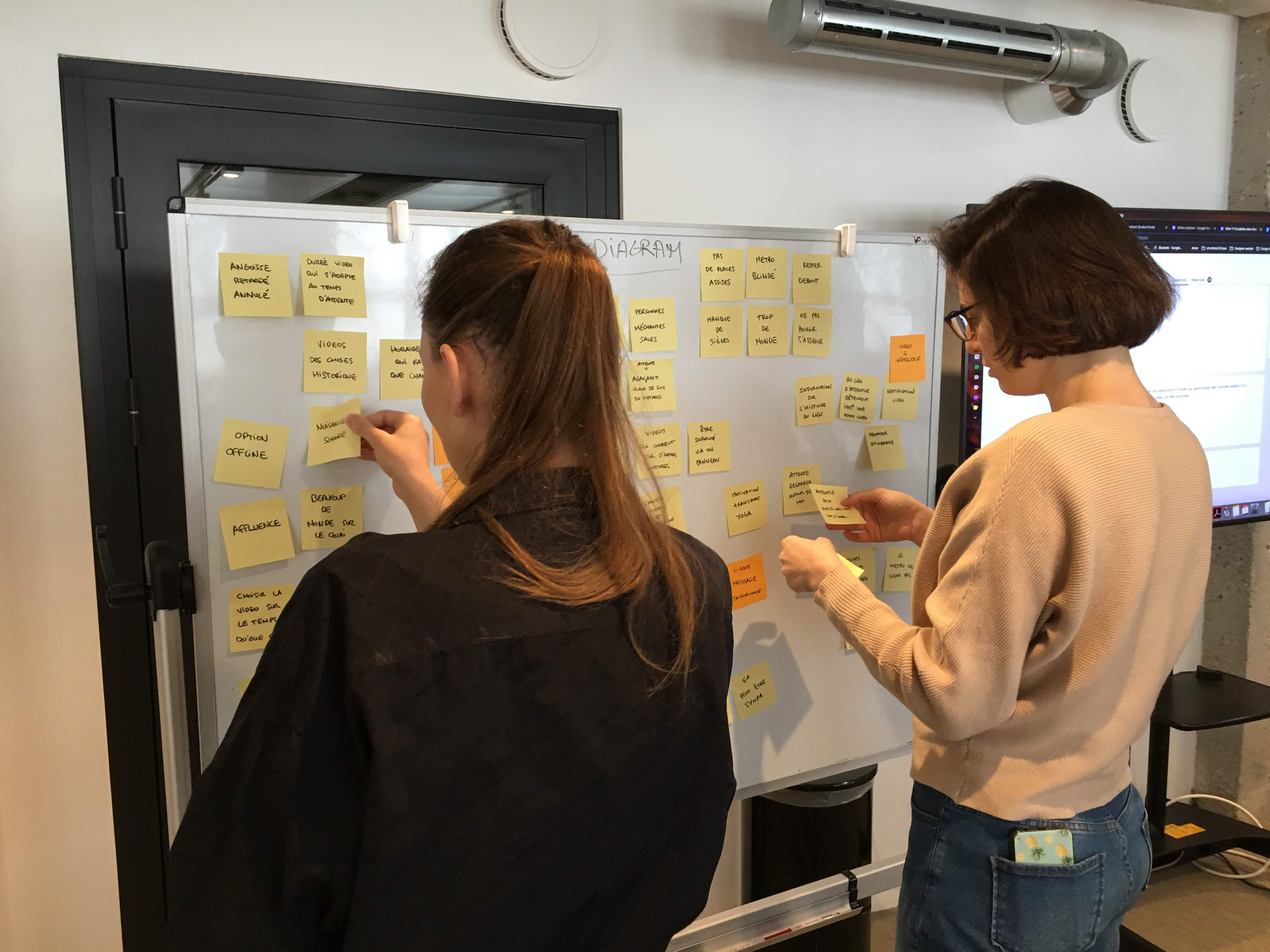
It's a great tool used to cluster findings so that you can physically see trends and relationships in data. To save time before the workshop, I downloaded my survey and user interview data. I wrote any quote, insight or all relevant information on sticky notes.
I asked to organize the notes
- Start by posting them without organisation.
- Physically group them by similiraties, creating clusters.
- Give a title for each cluster on a big sticky note.
- Highlight the main pain points with a dot voting.
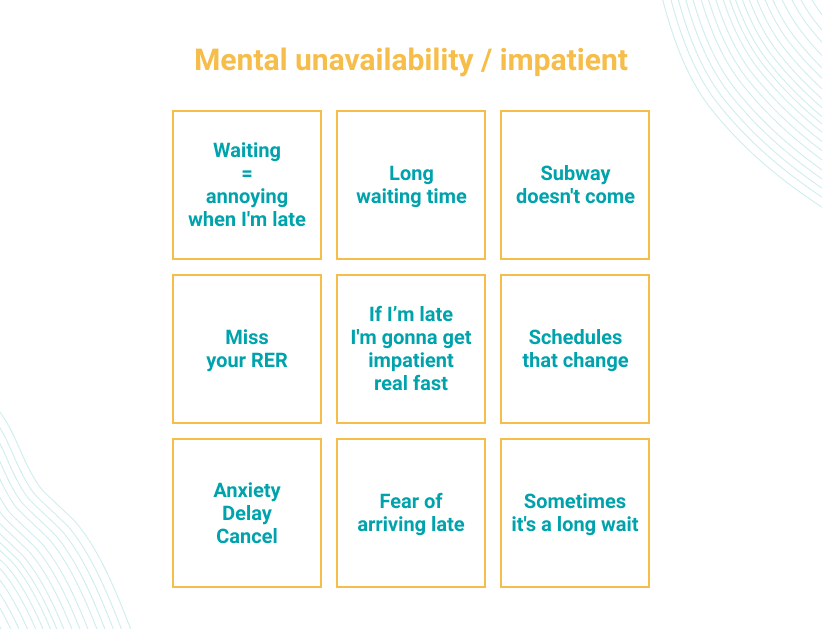
Main pain points
The main pain points that was voted is about the mental confort when people waiting for public transportation. The lack of comfort while waiting is also important and was not voted on.
Define the problem statement
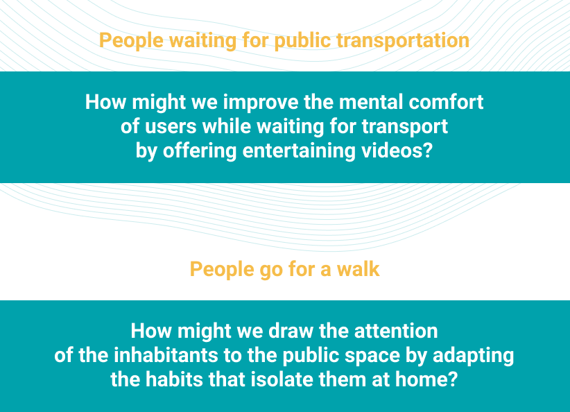
Now, we know the main problem that needs to be solved. It's time to reframe problems as opportunities with HMW. Using this formula:
How might we improve [situation/service/product] so that our customers are more successful based on [these measurable criteria].
"I just dropped a bomb."
I just dropped a bomb because Rony doesn't want "again" to make an app for people waiting for public transportation. I knew I was going to get stuck at this step and I bounced right back.
To disarm the bomb, I said design is about solving problems. I suggest doing complete this HMW together and do other HMWs based on your opinion with the help of the first survey and user research in public spaces.
User Journey Map
It is useful to create User Journey Maps because it visualizes the user’s experience at different levels. We should establish stages in a timeline and then add context, thoughts, and emotions. This tool helps us further empathize with the user so that we can find opportunities to make their journey better.
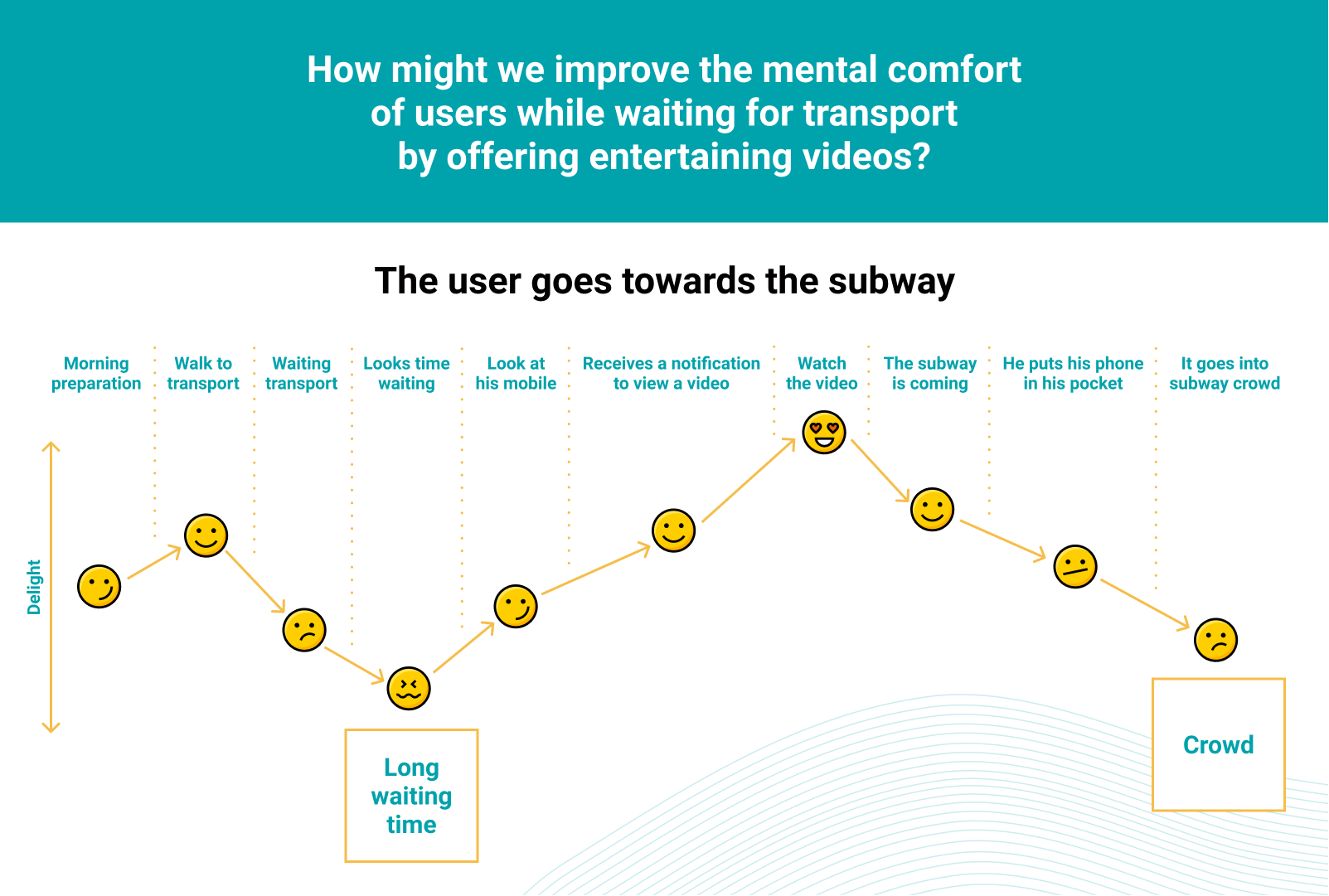
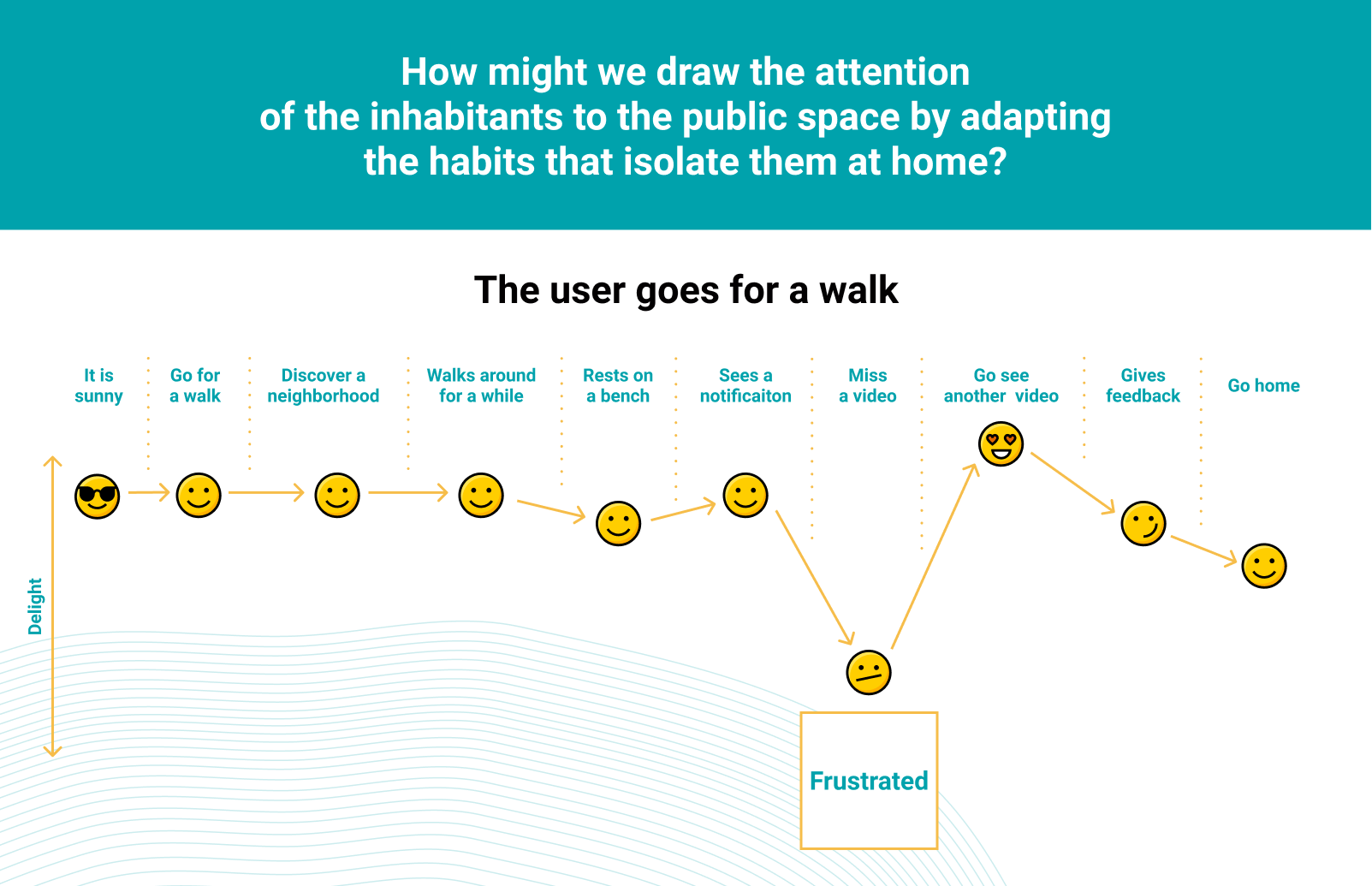
We understanding better the emotions and the user pain points. This user journey "The user goes for a walk" was done without digging deep enough into the needs of the users (e.g. no affinity diagram). My role as a facilitator is to unleash creativity and keep a good team dynamic. To move forward in the best conditions and save time, we made this user journey. This idea is an obvious solution but the notification is an interesting feature to encourage the user to consume a video during his walk. It will address users already sensitive and willing to see the content of the app.
Lightning demos
I will not detail each points of the workshop that we did with the founders of Igloù. We took 30 minutes to get inspired with products or services that we think we can use as inspiration for Igloù app.
We talked about Cinemacity app, which was an app that allowed you to display film clips on a map in the same place where it was shot. You have to be within 300 meters to be able to view the clip.
See the trailer:
When I read Igloù's brief I immediately thought of the Cinemacity app. I did some digging to find out why the app was no longer available and how it had been designed. I contacted the founder of the Small Bang agency, Pierre Cattan, the creator of Cinemacity. Pierre Cattan explained to me that he knew from the beginning the lifespan of the app. Indeed, Arte had given the broadcasting rights for only 3 years.
They tried to convert users into creators. Users could also express their creativity by proposing remakes of the films. But it's completely different between watching a movie and being an actor. The concept didn't work and the Cinemacity app died at the end of the broadcast rights. It should also be remembered that Cinemacity was launched in 2013 and at that time the internet and mobiles were not as powerful as they are today. For example, there was no 4G network. The people did not have the same culture.
The founders of Igloù want to make a similar app but the difference is that they have control over the films because they will produce the video clips themselves.
For the part of the video clips to be made. I proposed the overlap reality technology developed by Skyboy.
See the demo:
Overlap reality is very powerfful but for an early stage startup it's off budget and the founders want to keep control of the film aesthetics.
From research to ideation
Ideation exercises are a means to answer one of the most important questions in the design-thinking process:
"How do I turn my learnings into an opportunity for design?"
Naturally, you have been thinking of solutions since the moment you read the project brief. We have talked to users, validated the assumptions, and stepped into their shoes to understand how the product fits within the context of their life. With all this preparation, it is finally time to get some of solution sketches and ideas on paper!

At this time of the workshop it's late and we're starting to get rinsed. I decided don't do all the Four step sketch and we switched directly to several rounds of Crazy 8 and stop the workshop. We generated some ideas. The dot voting is on the parts:
- Onboarding
- Navigation in the map
- Video selection
- Video content
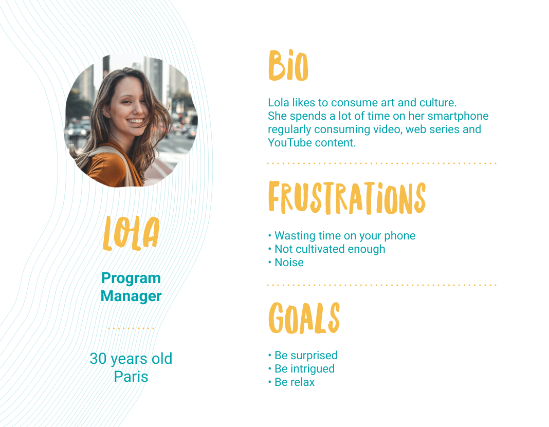
Persona
Now I can synthesize the findings with a persona from the behaviors and motivations of the many actual users I encountered in my research. The most important reason to create personas is to set a common understanding of the final user. For the design team, the client, the developers, and any other important stakeholders involved in the project.
Information Architecture
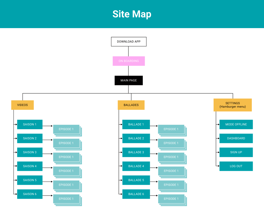
I created the structure with a Site Map that alowed us to understand where we are as Lola (Persona). About the information this is the basic step. The goal is to do gradual work out. I focused the features priority to satisfy early adopters.
MVP:
- Onboarding
- Main map
- Video path
- Video preview
User Flow
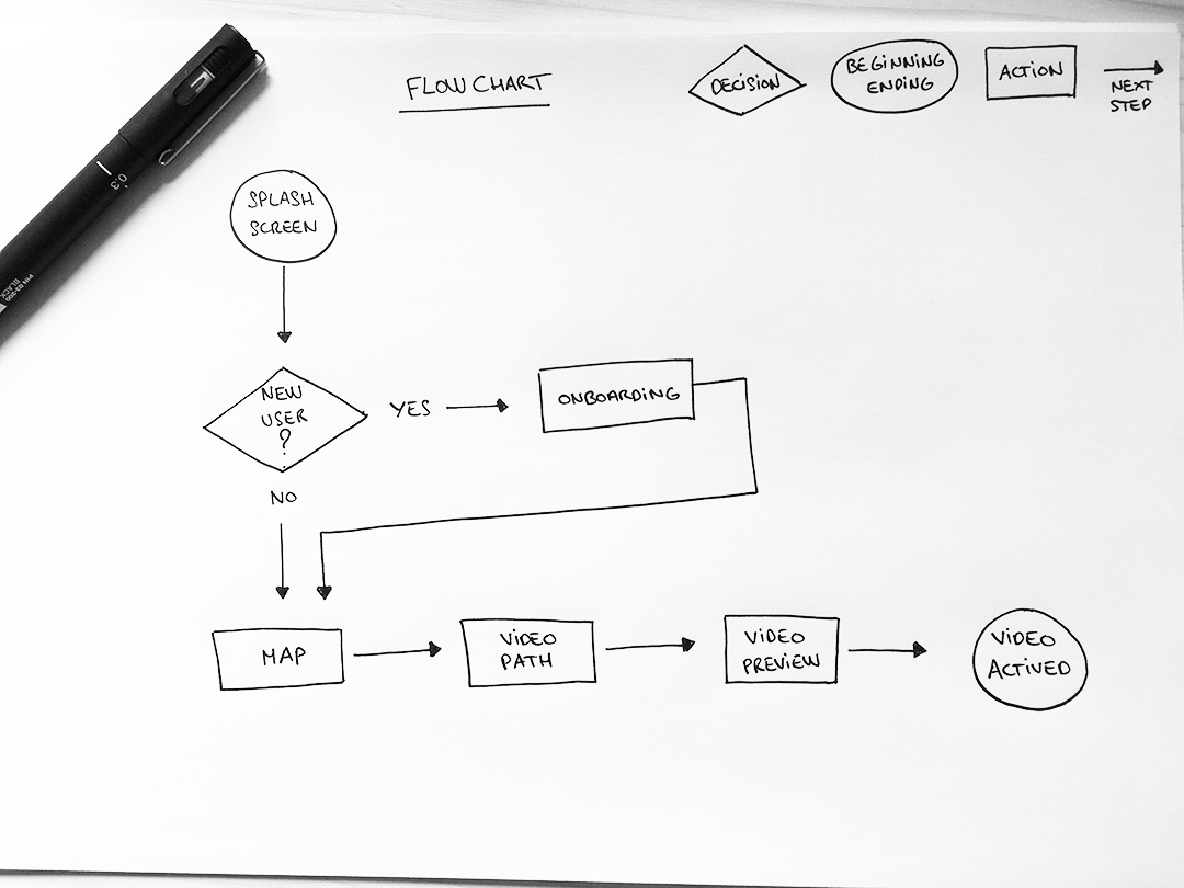
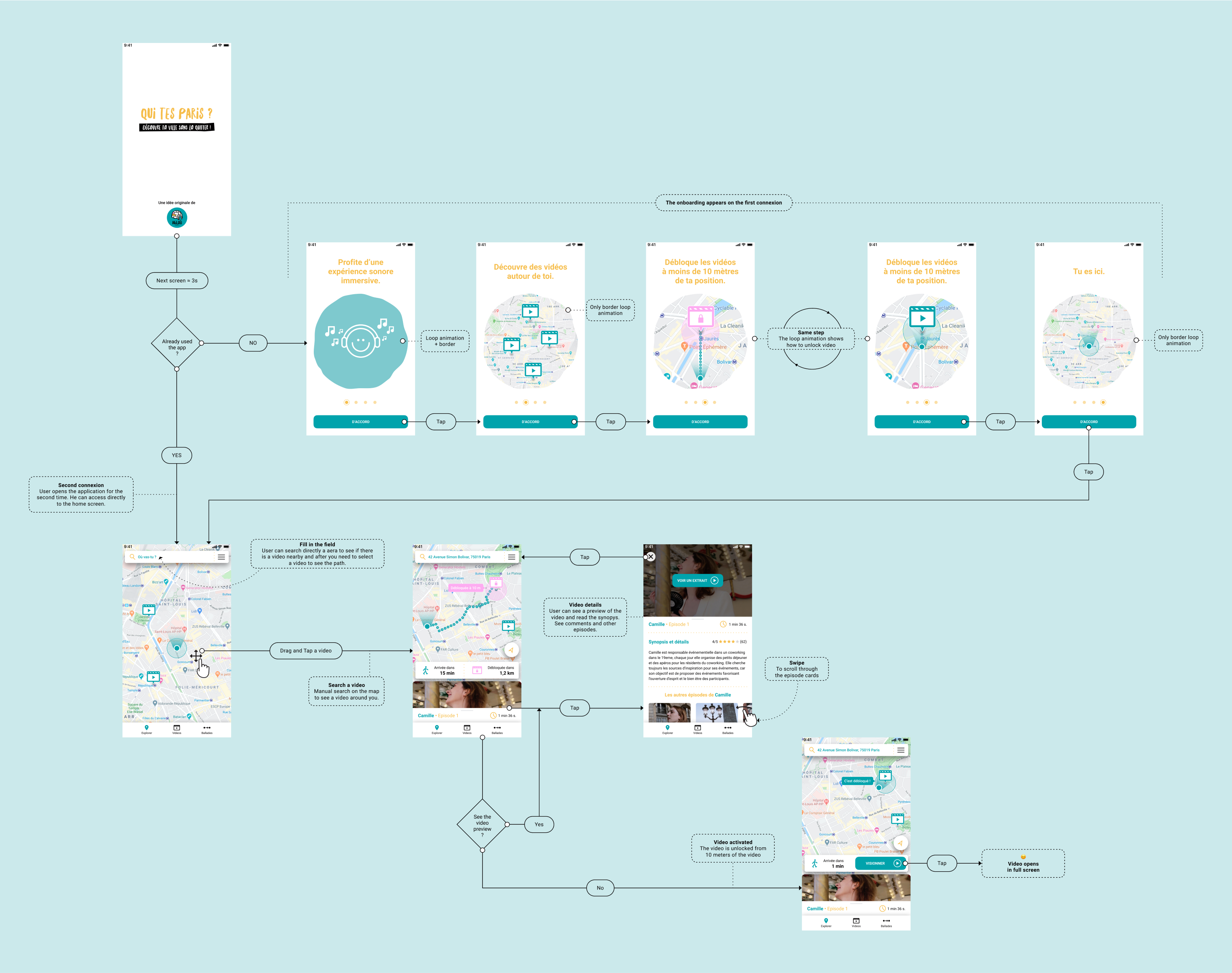
Always build a flow with users in mind. Knowing the motivations and needs of your users will help you create better user flows. Keep Lola in mind. Before sketching and prototyping, I creating a simple Flowchart on paper.
Beyond the User Flow
How to improve documentation in the designer/developer handoff?
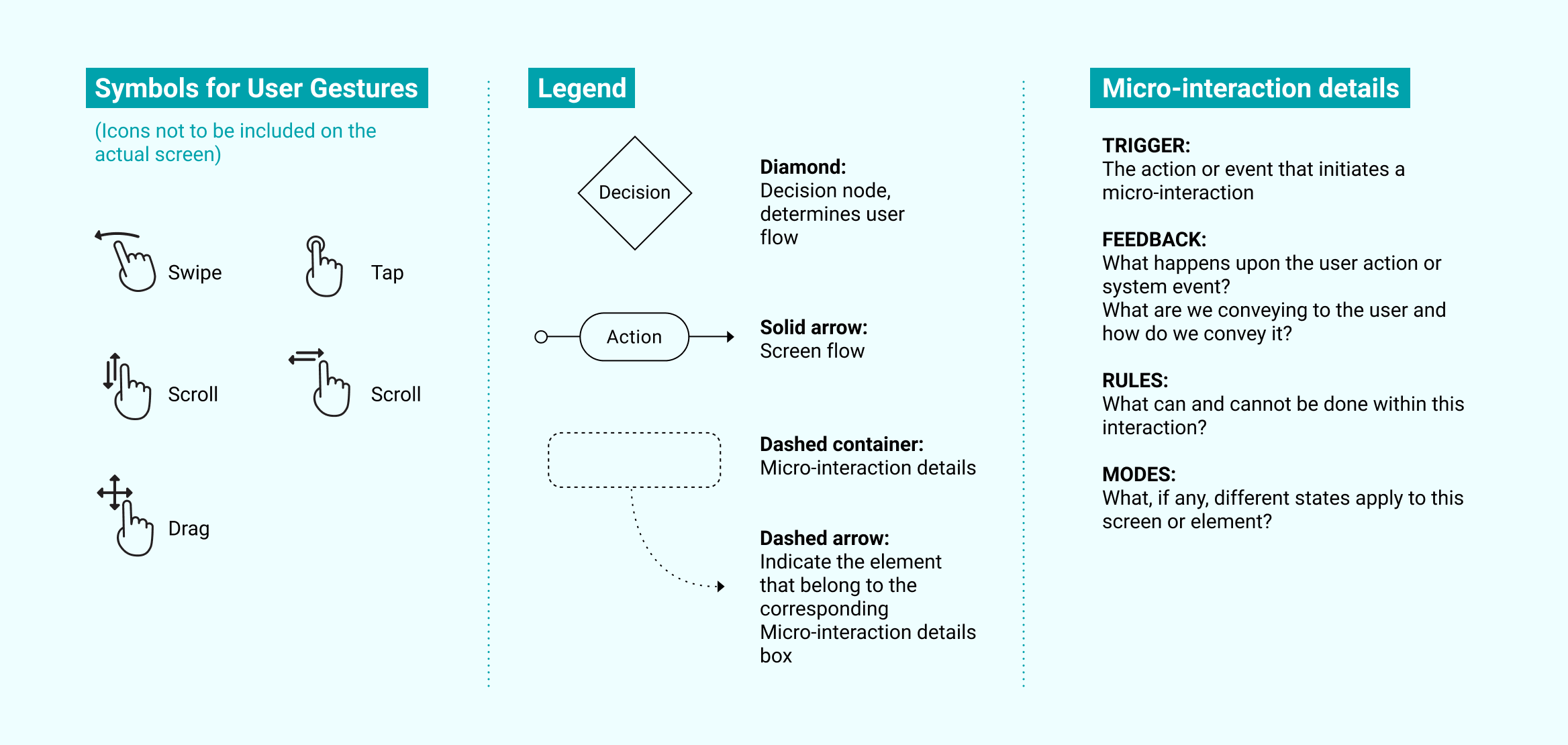
I started developing Interaction (IX) Flows with the help of this great article write by Havana Nguyen.
Why put together an IX Flow?
Communicating these interactions has many benefits:
- Centralizes the flow, visual design, and interactions in one document
- Reduces guesswork and ambiguity on the developer’s part
- Reduces mistakes during development
I integrate my own design in html/css/javascript and I also know how difficult it is for the developer front-end to understand the user flow with all the interaction design.
Let's take a look at IX Flow with the Hi-Fi wireframes.
Brand personnality
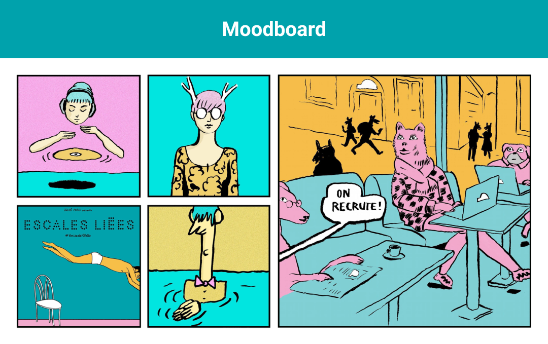
The constraint about the visual design direction was to use Igloù's existing visuals of a past event. I built the tone and atmosphere using the moodboard and the Igloù logo for the typography.
Igloù's founders gave me the name of the app. On this project, it wasn't the deal to take care of the brand identity. I made a simple text logo. There's a pun with the baseline but it doesn't work in English...

Hi-Fi wireframes
I designed the Hi-Fi wireframes based on the Flowchart as well as the Onboarding.

Micro-interactions
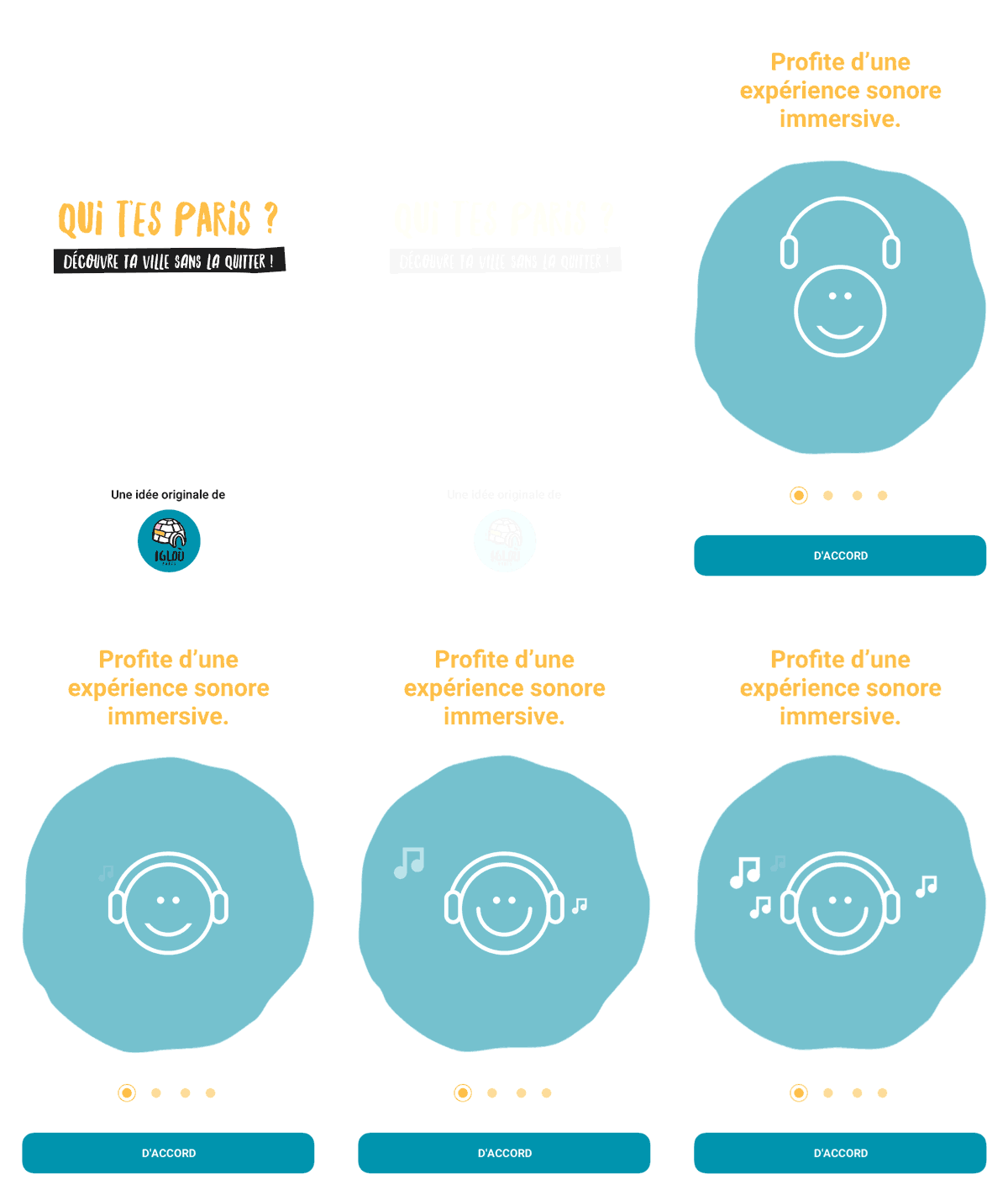
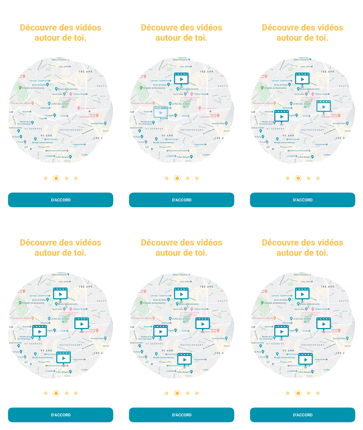
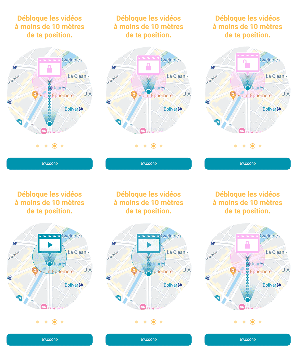
I built a user onboarding experience with micro-interactions to teaching the users how to use the app so that they can quickly and efficiently understand the value of the product. Micro-interactions increase user engagement by instantly communicating information in a way that doesn’t bore or distract the user. Onboarding is a make-or-break experience for new users.
UI interaction
- Left screen: onboarding.
- Right screen: video selection and path. Opening and closing the video content.
Hand-Off
I presented the project just before the lockdown. For the delivery of all files to the developer, I switched all my design that I had done on Sketch to Figma. The Covid 19 was the ideal periode to optimize remote work. I built the design system based on the Atomic Design methodology for creating scalable system and reusable components. You can check the Figma file here.
Reflection
A 2-week intensive adventure. Gathering the founders, the stakeholders... together for the kickoff is mandatory to align visions and avoid wasting time. If I had more time and resources I would have loved to dig deeper into the needs and behaviors of users through more thorough user interviews and user tests. I built reusable UI components and UX patterns that created a cohesive visual language throughout the various flows, in addition to maintaining a consistent voice and tone. Ultimately, the founders, Rony and Elena was proud of the amount of creative problem solving we were able to accomplish within a very condensed timeline. Next step, test and iterate!