Filters Flow
December 2020 • 3 min read
Case
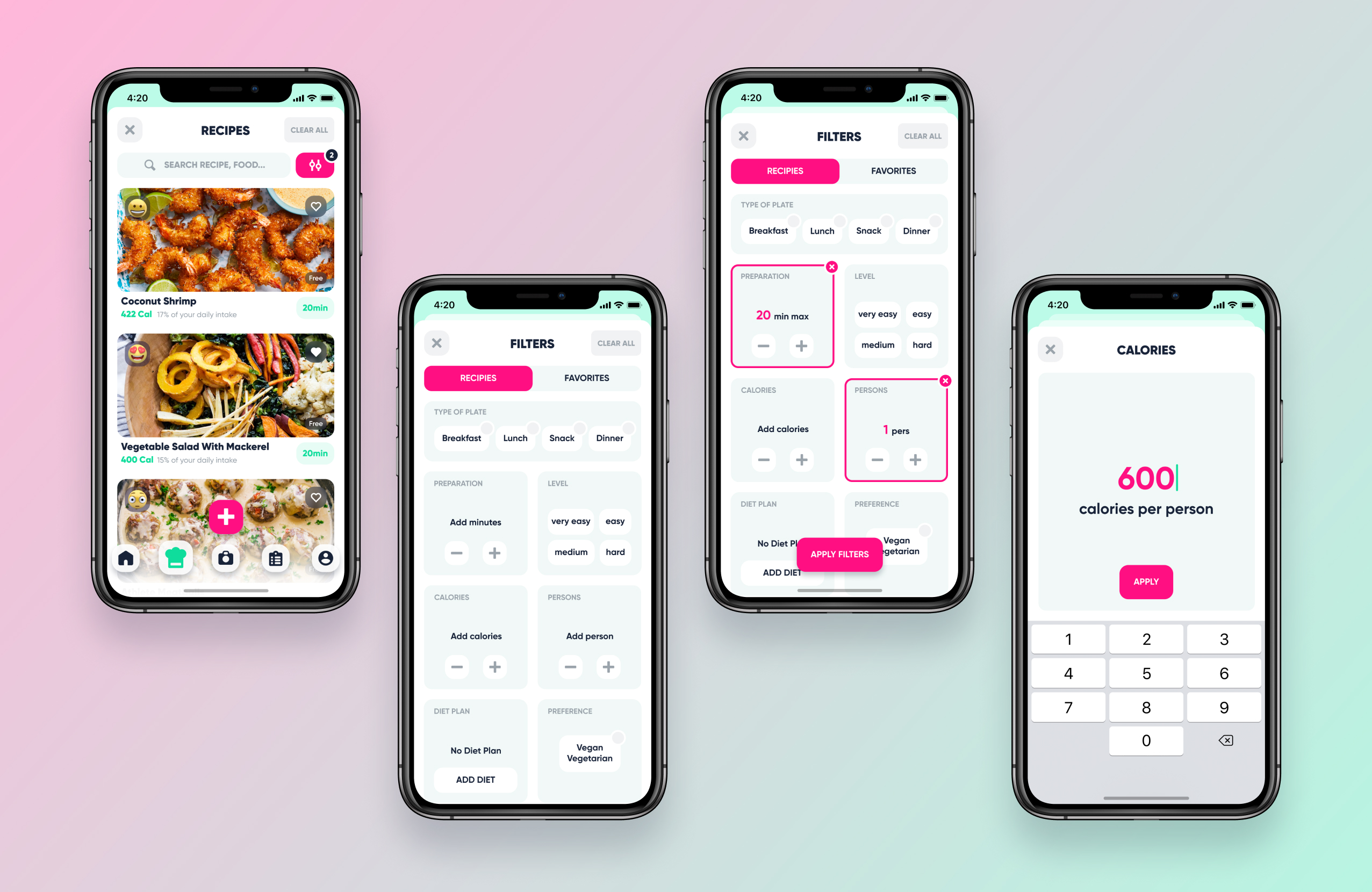
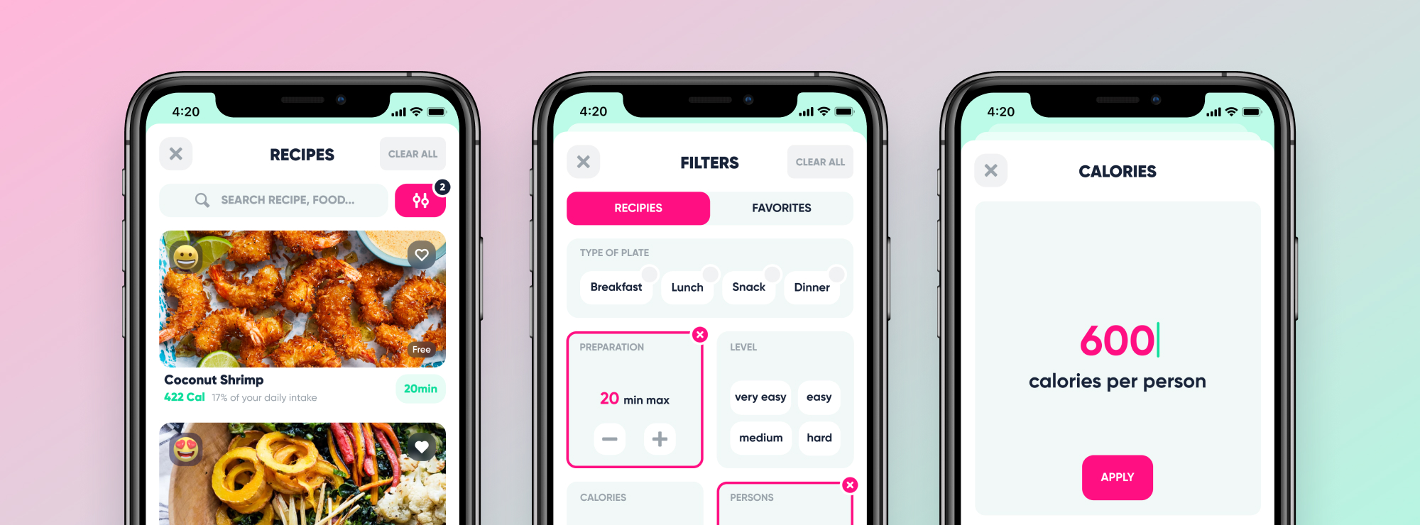
This feature allows users to find recipes matching their desires.
Role
UX/UI Designer
Timeframe
December 2020
Overview
The objective was to demonstrate the ability to understand the needs and bring a creative and adapted solution.
Problem Brief
The recipe section is an important source for users who want to discover a balanced and easy recipes to cook. Currently users can't find recipes that match their desires, the food they have, the time they have to cook, their remaining calories...
Pain points
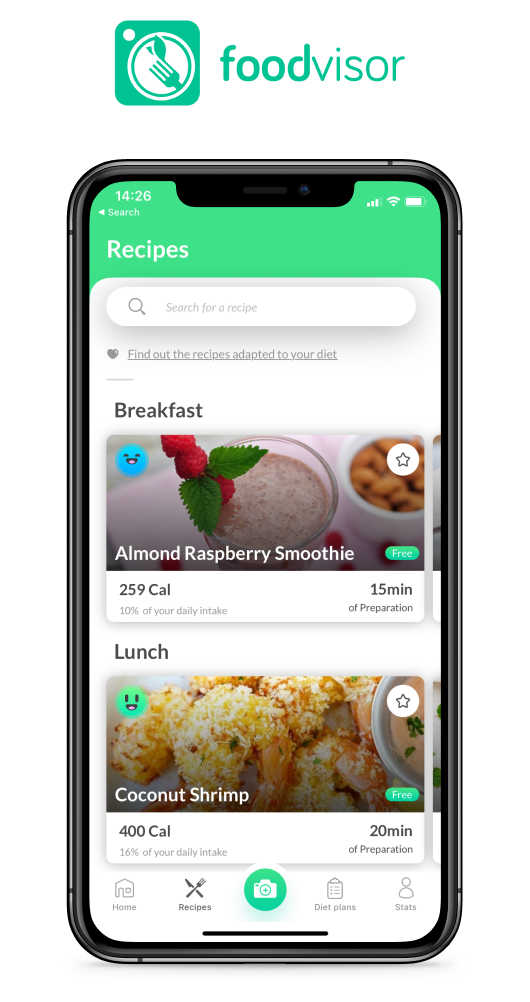
The search bar "Search for a recipie" doesn't allow multiple searches. Only one word can be put. The search is done only on the recipe titles. The content of the recipes is not used. There is no auto-completion. There isn't suggestion if nothing is found. There are no filters to precisely target these desires.
New design
I studied competitors and done research in the fields of nutrition and recipe creation. I imagined filters to find and then visualize the perfect recipe. I redesigned all the UI interfaces, brand, colors... just for fun!
You can see the full case study in Figma.
See case study
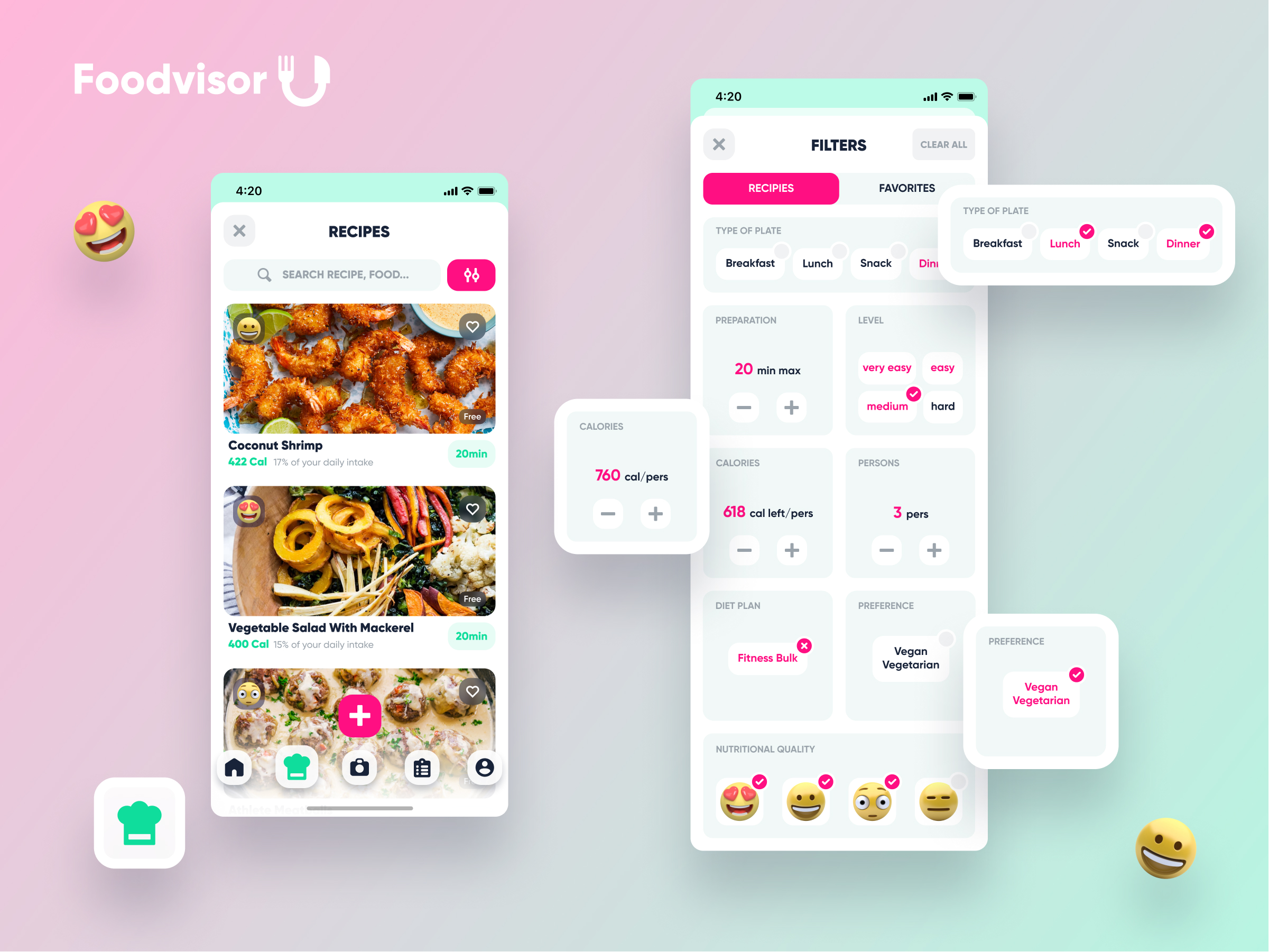
❖ UI Library
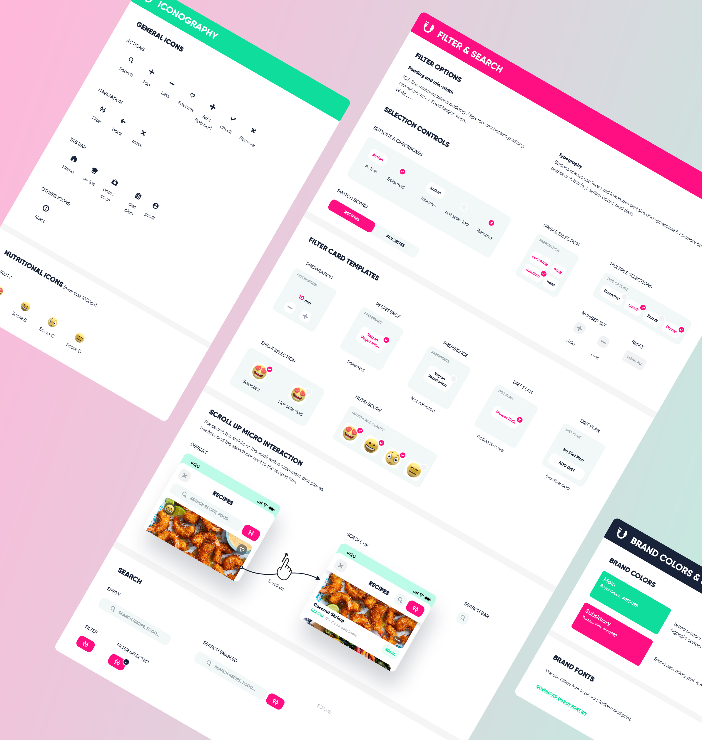
I built the UI library for the Design System in parallel with the evolution of design.
You can see the UI Library in Figma.
See UI Library
🎯 User Flow
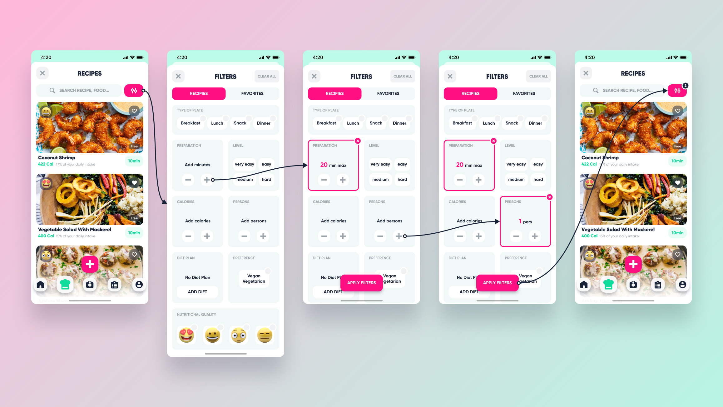
The user flow shows how to access the filters. At a glance, you can see the added filters highlighted on the cards with a colored outline. It is possible to remove a filter with a close button or all of them with clear all button. After applying filters, the number of filters is displayed. (I didn't updated all the iteration in the UI library...remember, it was just a test 😝)
You can see the User Flow in Figma.
See User Flow
