Feature
February 2020 • 4 min read
Case
This Facebook app feature allows you to customize your shortcuts in the tab bar.
Role
UX Researcher
UI Designer
Interaction Designer
Timeframe
February 2020
Prototype Outcome
Enjoy!🤘
Why this feature?
Because many users don't know how to use Facebook flawlessly or are not aware of all the features. The tab bar information don’t match with what they like. It’s frustrate, they are not interesting about this button. They don’t have what they want in the menu. It’s boring, they have to look for the settings in the hamburger menu and it’s a mess because there are too much informations.
Research & discovery
I did interviews to validate the users assumptions. I met users and here is a sample of 7 users.
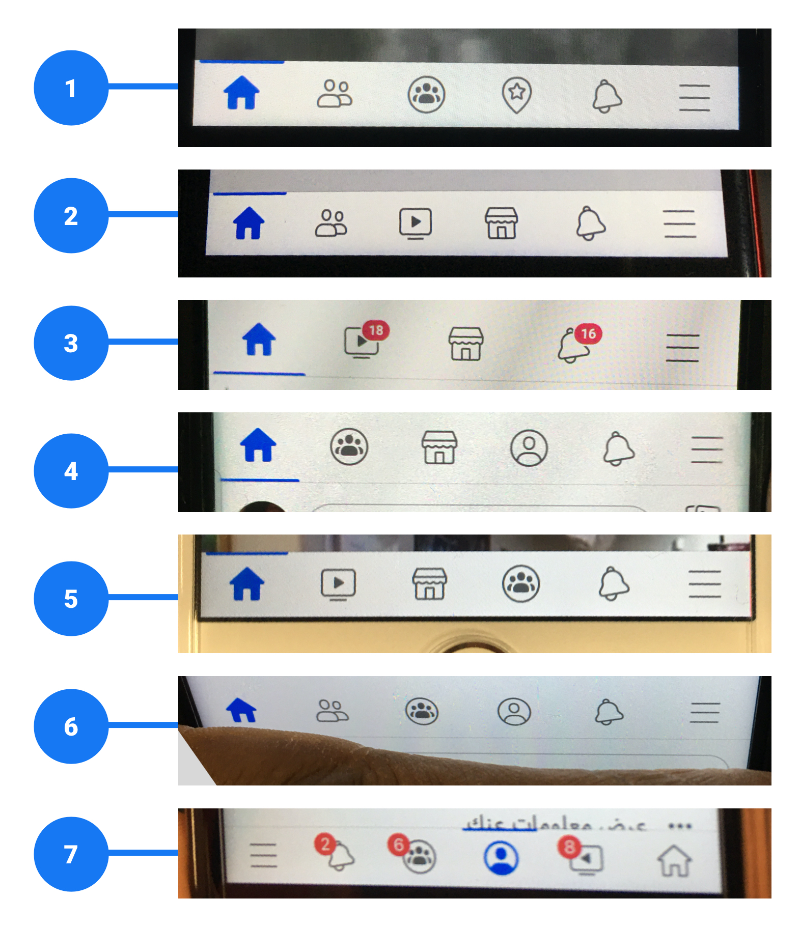
As you can see, each user has his own tab bar. Exception for these buttons always displayed: home, notification and hamburger menu. The Facebook algorithm must surely display the categories most used by the user but it is not really efficient. Users don’t use all buttons and sometimes none. They often go to the hamburger menu to search for the settings that interest them. Like for example: user number 1 often search for his “profile” in the hamburger menu and doesn’t use the button “event” on the tab bar (icon map pin with the star inside).
Feature to customize your tab bar already exists but the feature is incomplete and doesn’t meet user needs.
Before the interview ended, I asked each user if they were aware of this existing feature. You have to long press on the tab bar to display the customize option. No users were aware of this option.
However, they were really happy to discover this feature. They wanted to be able to add a shortcut. Unfortunately this is not possible at the moment.
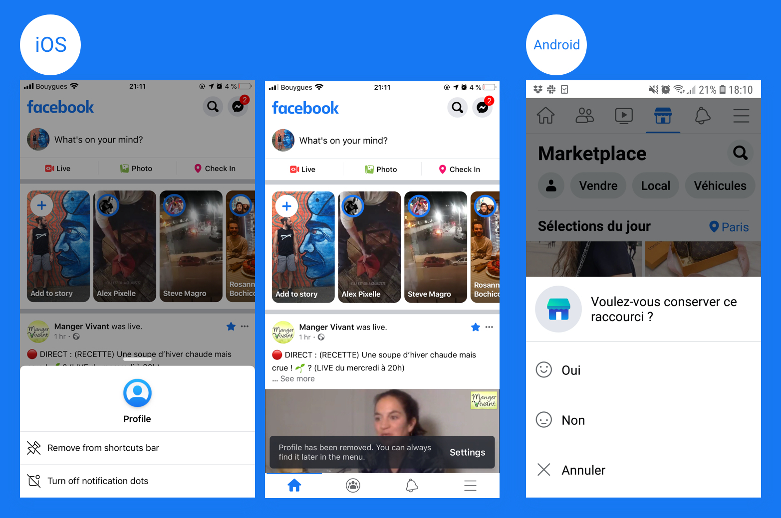
There are variations between iOS and Android. On iOS you can remove your shortcuts and turn off notification dots. A second screen says: “You can always find it later in the menu” but it’s not really clear and “Settings” doesn’t look like a button. On Android you can just vote if you want to keep the shortcut or not.
During writing this post, I found this TechCrunch article: Facebook finally lets you banish tab bar tabs & red dots. This article is interesting because it is written we can manage our shortcut but it doesn’t reflect the reality of my user research. I asked each user to long press on the tab bar and the options were always the same for iOS and Android. There isn’t the option “Manage shortcut bar”.
Screen 1: Take a look below on the TechCrunch example: “Manage shortcut bar”.
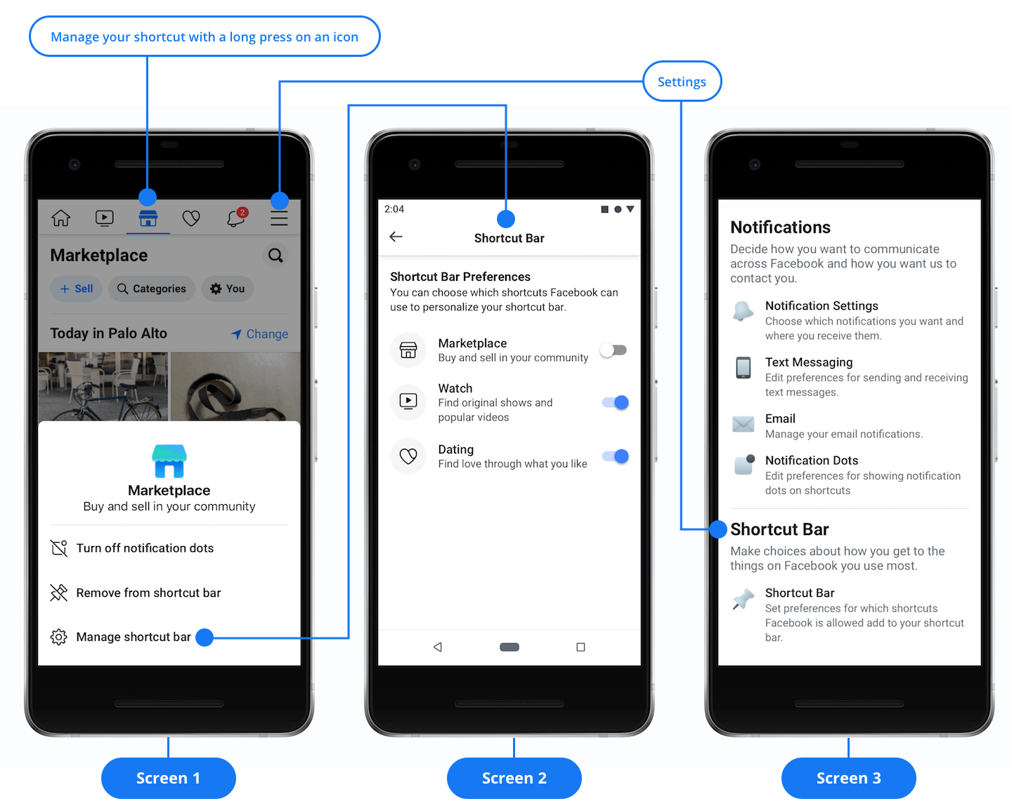
Screen 2: The TechCrunch example when you tap on “Manage shortcut bar” (Screen 1) you access to the "Shortcut Bar Preferences" (Screen 2) and they are toggle buttons: “Marketplace”, “Watch” and “Dating”.
Screen 3: Thanks TechCrunch, you can find the shortcuts settings in the hamburger menu. But to find settings you have to scroll and to find shortcuts bar you have to scroll for a long time…very boring.
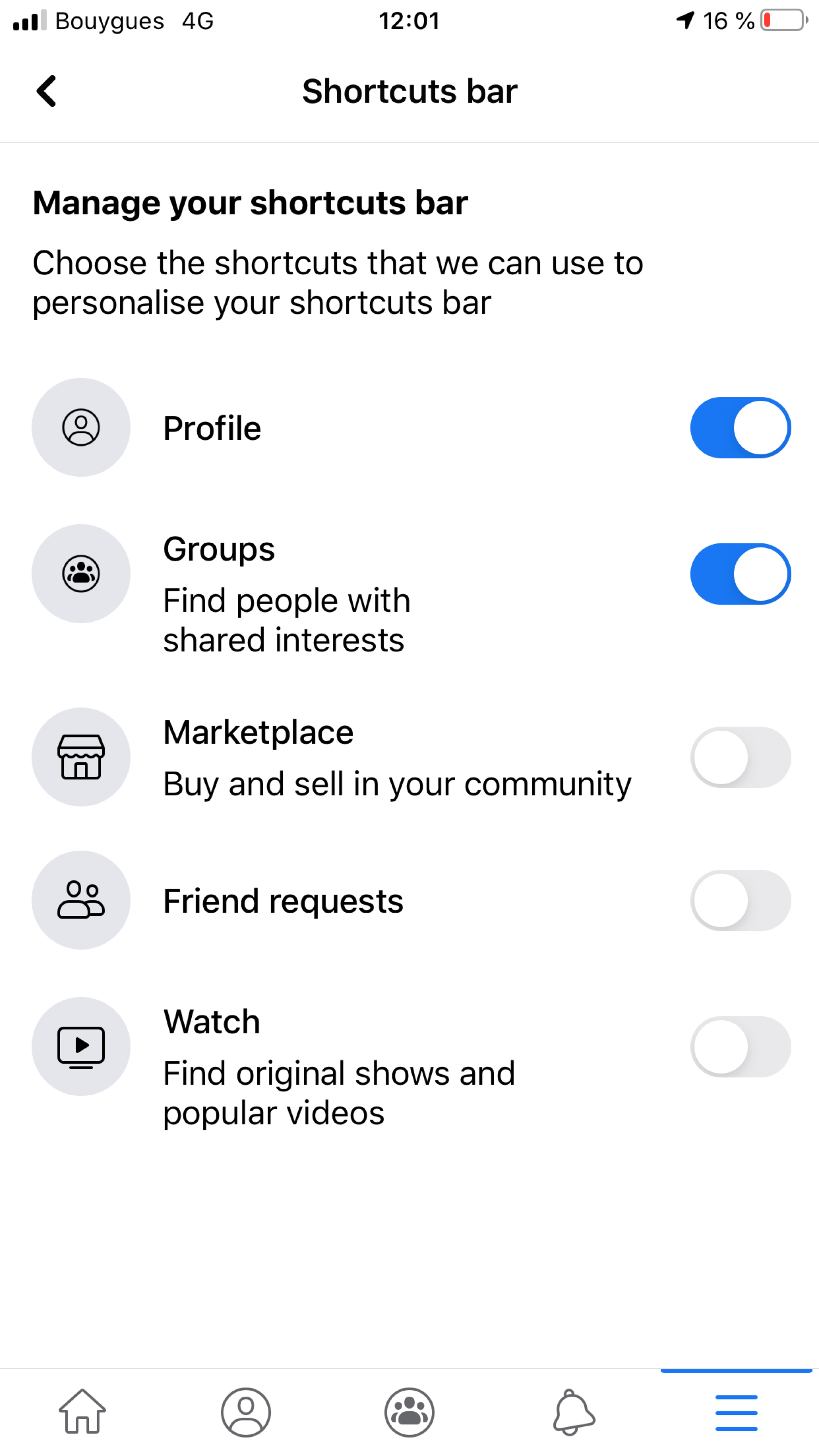
On my mobile the informations are different, I have the toggle buttons: “Profile”, “Groups” “Marketplace” “Friend requests” and “Watch”. The next step will be to organize user testing to see the options displayed on the users mobiles.
Wireflow
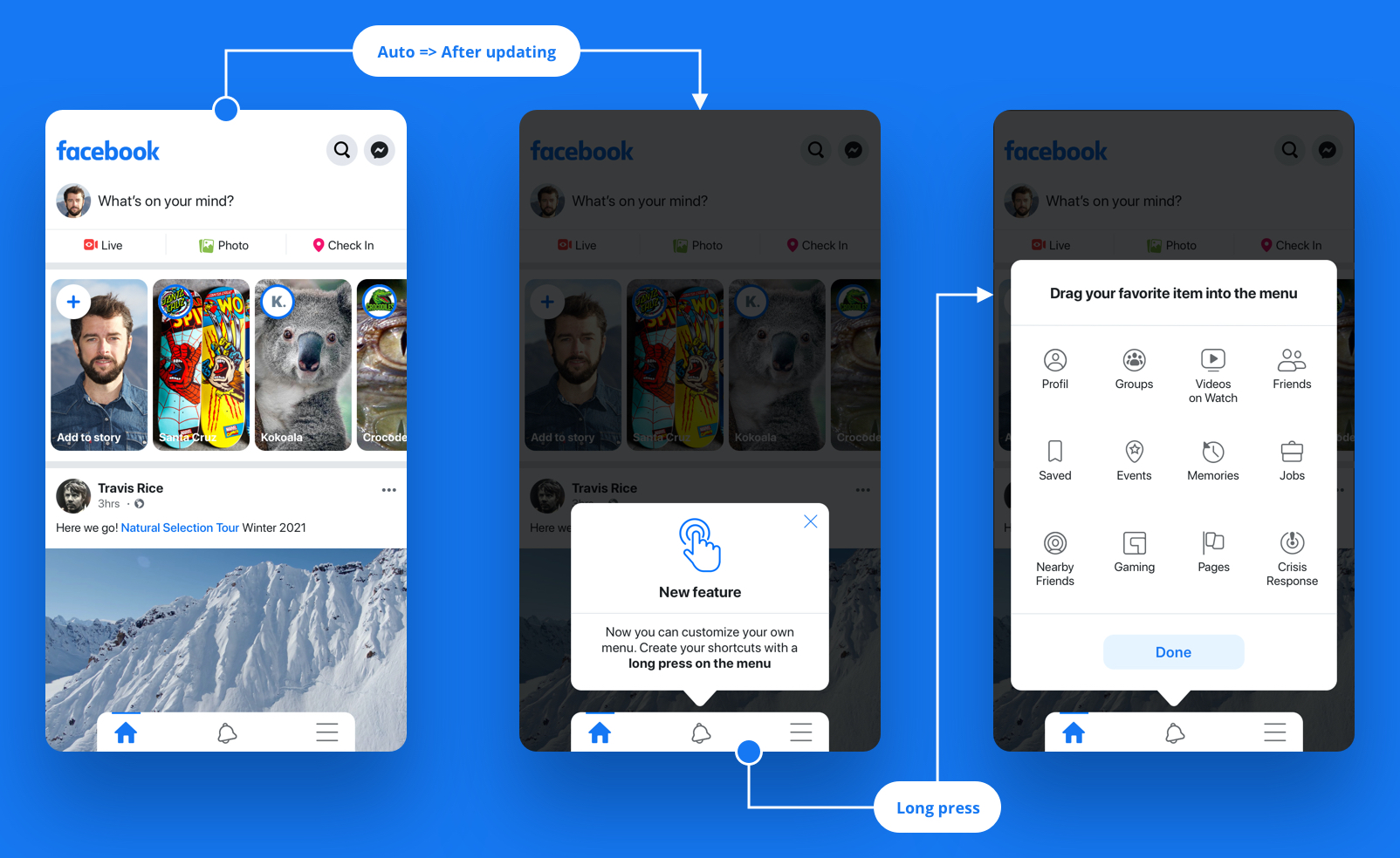
The hi-fi wireflow is based on 2 main screens.
- Open the feature.
- Drag and drop your item.
The goal was to reproduce a faithful design for quality user-testing. The biggest work was on the micro interactions.
Prototype
Teach the user how to use the feature. When the Facebook app opens for the first time after this update feature, a pop in appears automatically to explain the feature. If the user uses the feature, it will no longer open.
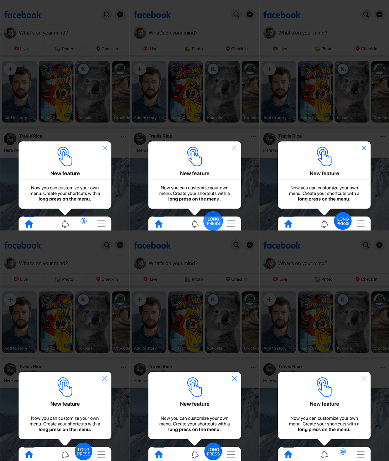
Long press gesture
The micro interaction shows how to access to the feature.
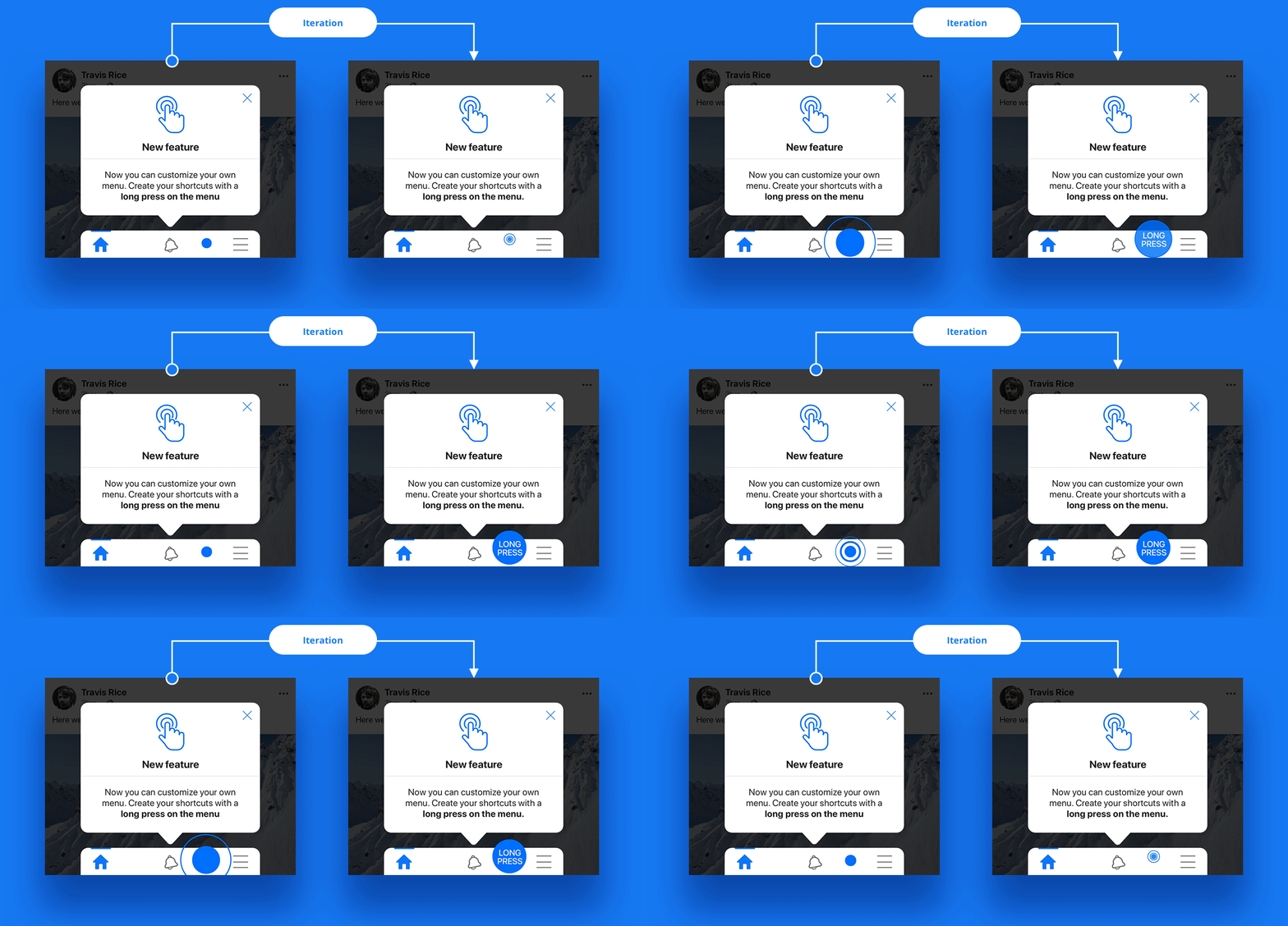
Iteration
The problem was the users only tap the screen and did not long press. After the iteration the users understood the process with the text “Long press”.
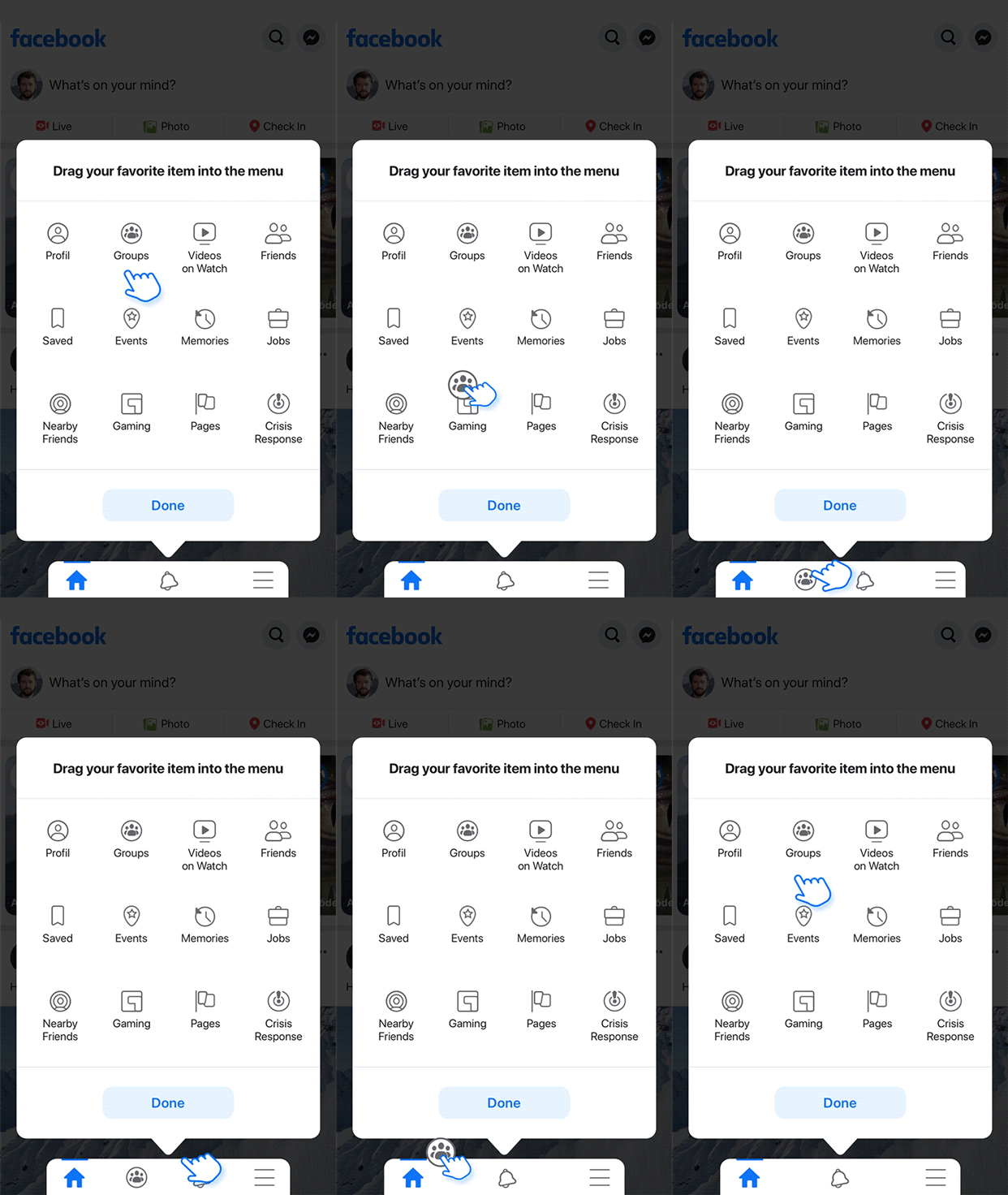
Drag and drop gesture
I took inspiration from existing interactions to manage the phone apps. The micro interaction shows how to do the drag from your favorite item into the tab bar.
Final prototype
The prototype shows the first connection and all the gestures. Here the prototype example adds Video on Watch and Saved buttons on the tab bar.
Reflection
During the interviews, several users used the button "Saved" or "Profile". They want to be able to add these shortcut buttons to the tab bar. Many categories are missing and it is frustrating for users to not be able to create their own shortcuts.
Any new feature requires user testings to be successful, even if it is backed by research on machine learning science. Usability testing has shown that users don't take the time to read. Iterating is essential to achieve and refine your goal.
“Details make perfection, and perfection is not a detail.”
Leonardo Da Vinci.
I hope you like this feature!